How to design Cyber Monday coupon posters for 2026
Make a Cyber Monday coupon code easy to find and copy, with our two posters, the real hierarchy retry and checks for code and conditions.
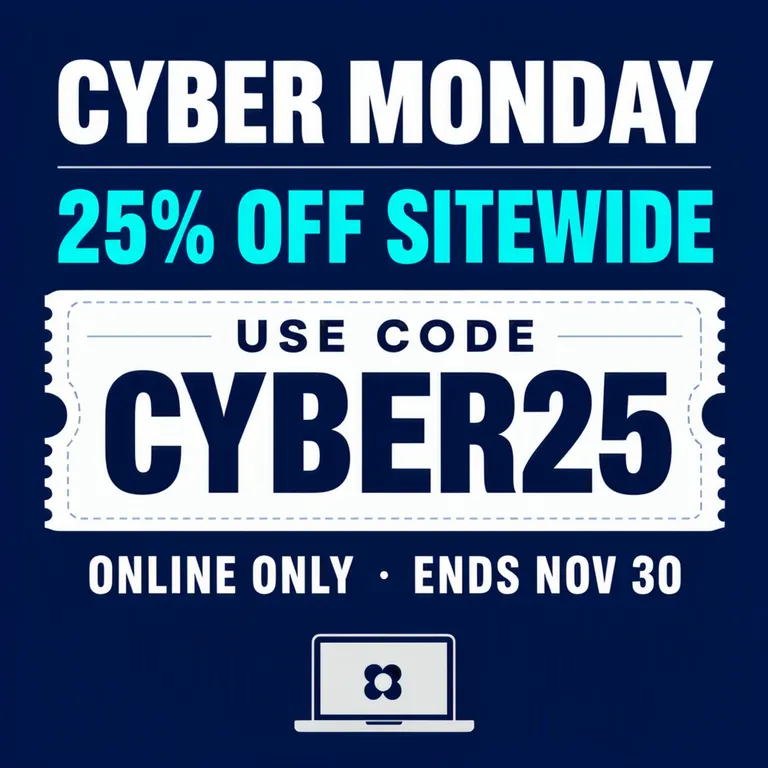
Cyber Monday coupon posters for 2026 should make the code easy to find and copy, with the offer and conditions close by. Cyber Monday falls on Monday, November 30. We put CYBER25 on a separate ticket in these examples, giving shoppers a clear place to look for the characters they need to enter.
TL;DR
- Give the coupon code its own space and the strongest emphasis.
- Keep the offer separate from the code people must enter.
- Inspect every character, then inspect the reading order.
- Confirm the code and its conditions against the promotion setup.
What should be largest: the discount or the code?
For a poster asking someone to enter a coupon, make the code the easiest text to locate. The sample combines “25% OFF SITEWIDE,” “USE CODE,” “CYBER25” and “ONLINE ONLY · ENDS NOV 30.”
We chose CYBER25 to avoid the look-alike groups 0/O and 1/I/l. When you control the code, choose one that is easy to transcribe. For an assigned code, preserve the exact characters and improve legibility through size and spacing.
CYBER25 and the offer are made up for these examples, not a code to share with customers.
Make one like this Open this image on MOSS Image
Made in the Layout Builder with these boxes:
| Box text / object | Job | Approximate position |
|---|---|---|
| CYBER MONDAY | Occasion | Top |
| 25% OFF SITEWIDE | Offer | Upper middle |
| USE CODE | Code label | Above ticket |
| CYBER25 | Code to enter | Centre |
| ONLINE ONLY · ENDS NOV 30 | Conditions | Below ticket |
| (illustration) | Laptop | Bottom |
The layout passed its first text check, and the code was the largest element on its own ticket. “USE CODE” acts as a label, while the percentage describes the offer. Keeping these roles separate gives you a direct test: can someone point to the string they must type without reading the rest of the graphic?
Why did the prompt-mode version need another attempt?
Our first prompt-mode result made CYBER25 the largest text on the ticket: about 127 px of cap height against 56 px for “CYBER MONDAY” on a 1024 px canvas. We generated again with the same prompt and a new seed, and the second result is the one below. In that version the order reverses — the headline measures about 67 px and the code about 54 px — so the ticket no longer points at the characters a shopper has to type. Use the layout version above as the reference for hierarchy, and treat the prompt-mode image as an example of what to catch on the re-read.
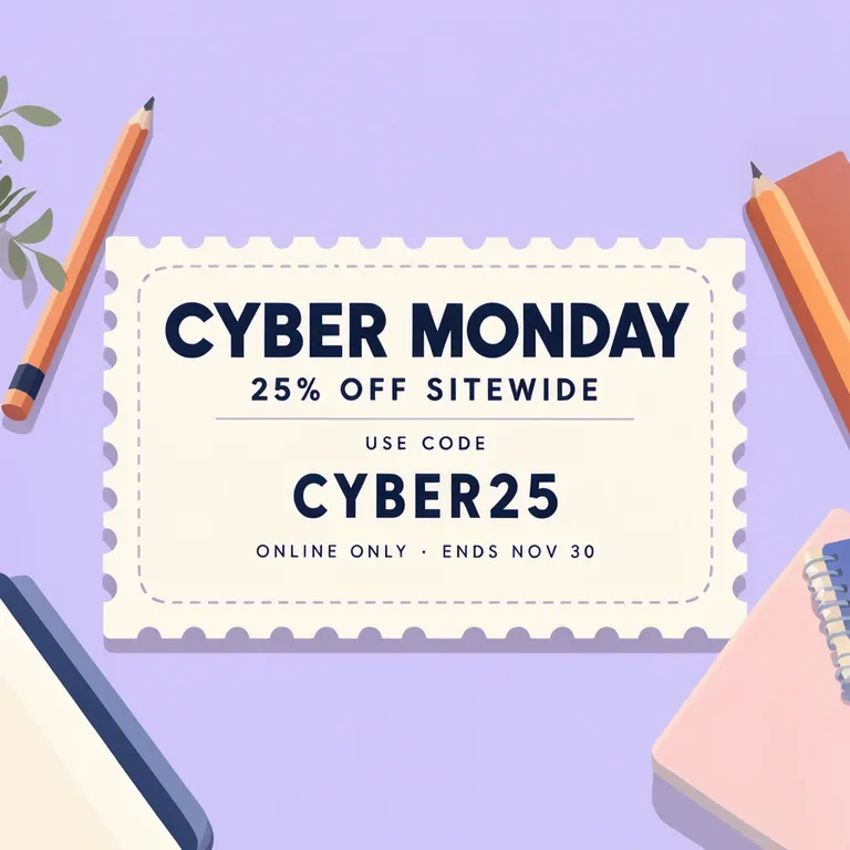
Make one like this Open this image on MOSS Image
Made in prompt mode with this exact prompt:
Square social media graphic for an online stationery shop's Cyber Monday sale, flat illustration, soft lilac background, a large paper coupon ticket with a perforated edge in the centre, a few pencils and notebooks around it. The code is printed in big bold monospaced capitals on the ticket. Text, render exactly and add nothing else: headline 'CYBER MONDAY'; line '25% OFF SITEWIDE'; small label 'USE CODE'; code 'CYBER25'; footer 'ONLINE ONLY · ENDS NOV 30'.
For your own result, carry out two separate checks. First compare the code character by character with the approved string. Then look away and return to the whole image: does the ticket draw your eye before the headline? A correctly spelled code that is difficult to find still needs a composition decision.
How do you review a coupon without overlooking the conditions?
Inspect the code, benefit and eligibility separately. A large ticket should not make the rest of the offer unreadable.
| Part | What the sample says | What you must verify |
|---|---|---|
| Code | CYBER25 | Exact approved characters |
| Benefit | 25% OFF SITEWIDE | The offer actually configured by the seller |
| Channel | ONLINE ONLY | Where customers may use it |
| End date | ENDS NOV 30 | Date plus any necessary time and zone |
The example footer gives an end date but no exact hour or time zone. If your campaign depends on a precise cut-off, confirm it and add it to your version. Also confirm whether “sitewide” is true; use the actual product scope if the promotion has exclusions.
Before posting, ask a colleague to read the code back from the image and compare it to the real promotion setup. Then inspect the conditions at the size the graphic will appear on a phone. Keep the copy of the code in your accompanying message consistent with the image, so a correction in one place does not leave the other stale.
What can still go wrong before printing or sharing?
Our shared prompt-mode result keeps every character right but demotes the code below the headline, so proofreading has to cover emphasis as well as characters. New generations can add, omit or merge text; compare the code with the promotion setup before sharing.
If the code is too small, reserve more space for it in the Layout Builder or simplify the surrounding scene before generating again. Keep the conditions readable as you enlarge the ticket. For print, make a proof at the intended size and ask someone to transcribe the code without being told it first. For a digital post, check the displayed version as well as the full-size file.
How can you make the coupon code the first thing people see?
- Use a 1:1 square canvas, matching both of our coupon graphics. In the Layout Builder, draw a large central ticket for the code, a small “USE CODE” label above and a conditions box below.
- Place the event name and discount above the ticket, with the laptop illustration at the bottom. Paste the assigned code as a single string and make its box the strongest text area.
- For the stationery version, open the AI poster generator at 1:1 and quote the headline, benefit, label, code and footer individually. Use the exact-text guide to keep the pencil-and-notebook description outside those quotes.
- Read the code back before checking the offer. Then view the image at phone size: the ticket should be easy to find, and the channel and end date should remain legible.
MOSS Image Studio is an independent hosted studio for the open MOSS-Image model. Not affiliated with OpenMOSS.
FAQ
Does the code create the discount by itself?
Set up the promotion with the seller first, then copy the assigned code, discount and conditions into the poster. Test the code in the intended checkout before sharing it.
Can I replace a zero with the letter O to make it clearer?
Not in an already assigned code. Change the typography or spacing request, then inspect the result. The character string must stay identical to the one customers are meant to enter.
Why not put the code in the headline?
A separate ticket makes the code easy to locate and copy. Keep the headline for the occasion and the ticket for the exact string the customer must enter.
Sources
- 2026 occasion dates and weekdays — Checked on 2026-11-03.
Try it with your own words
Open the Studio, write a brief or lay out boxes on the canvas, and generate with MOSS-Image.