Concert and gig flyers
Artist, date, door time, venue, ticket price, one line each. Keep the artist name on a line of its own or the model splits it into two words.
Event flyers that get the details right
Flyers fail on the details: a wrong date, a garbled address, a price that reads like a different number. Write each line once, describe the look, and MOSS-Image sets the artwork around your exact words. The three flyers below came from prompts of four or five quoted lines.
3 free images, no card. Then $6 for 25, $18 for 100 or $45 for 300. One credit per image, 2K included, and credits never expire. Credit packs
The brief is filled in already: four quoted lines, a 3:4 portrait and a flat illustration. Replace the words with your own event, keep the quotation marks, and press generate.
Write a prompt, quote any text you need, and press Generate.
Real output, four or five lines each
No compositing, no retouching. Each flyer is a single MOSS-Image (SFT) generation at 3:4, made from the prompt shown and nothing else.
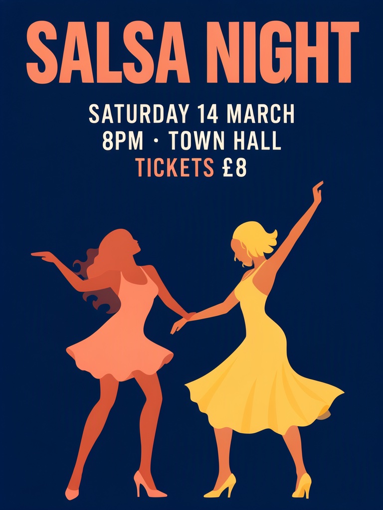
A minimal flyer with only these lines of text and nothing else: "SALSA NIGHT", "SATURDAY 14 MARCH", "8PM · TOWN HALL", "TICKETS £8". Do not add logos, sponsors, phone numbers, websites, credits or any other words anywhere on the flyer. Portrait 3:4, bold flat vector design, deep navy background with terracotta and warm yellow, two dancing silhouettes in the lower half, the heading large at the top.
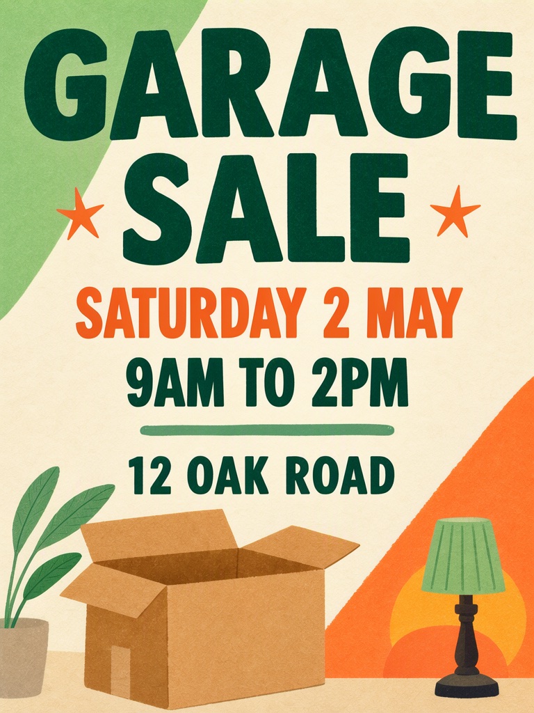
A friendly neighbourhood garage sale flyer with only these lines of text and nothing else: "GARAGE SALE", "SATURDAY 2 MAY", "9AM TO 2PM", "12 OAK ROAD". Do not add logos, phone numbers, websites, prices or any other words anywhere on the flyer. Portrait 3:4, flat illustration, warm cream paper with green and orange shapes, an open cardboard box and a small lamp drawn at the bottom, the heading in large heavy type at the top.
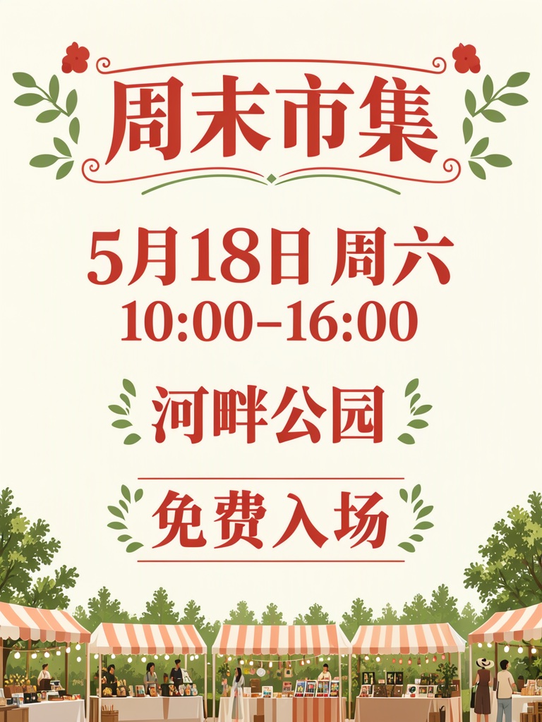
A Chinese weekend market flyer. The only text on it is: '周末市集', '5月18日 周六', '10:00-16:00', '河畔公园', '免费入场'. Do not add English words, labels such as Date, Time, Place or Note, kana, logos, phone numbers, websites, symbols or any other text anywhere. Below the heading show the date, then the time, then the place, then the free-entry note, in that order. Portrait 3:4, flat illustration, cream background with tomato red and grass green, heading large at the top, a row of small market stalls with striped awnings along the bottom edge.
Every one of these is the same job: a headline and four details that cannot be guessed wrong. The lines in quotes are what you type.
Artist, date, door time, venue, ticket price, one line each. Keep the artist name on a line of its own or the model splits it into two words.
Line-up, date, entry price, age limit. Write '18+' or '21+' as its own quoted line; digits sitting inside a sentence are where a number drifts.
Event name, date, start time, address, plus a line such as 'ALL WELCOME'. Long addresses are the usual failure: split the street number from the postcode.
Course name, date, time, place, and the one thing people must bring or pay. Cram five of those into a sentence and the price swallows the date.
Title, weekday, opening hours, address. Write the hours as '9AM TO 2PM', not '9-2': the model reads words, not dashes.
Business name, one offer, the dates, the address. Keep the discount on its own line, for example '20% OFF UNTIL SUNDAY'.
A flyer is read at arm's length. These four rules keep the date, time and address from turning into decoration.
Put the date, the time and the address on separate quoted lines. A single run-on line is where digits start merging.
Keep the currency symbol and the separator you want to see, such as 'TICKETS £8' or '10:00-16:00'. Say what the number means so the model does not invent a label.
A headline plus four details is a complete flyer. Every extra line is another place for a misspelling and another thing competing with the illustration.
Say what should sit at the bottom, such as 'a row of market stalls with striped awnings'. A named visual anchor keeps the model from filling empty space with invented text.
Three ways to end up with a flyer. The trade-off is not the price; it is who decides the layout.
The text is exact because you type it into a box yourself. The look is a template someone else designed: you pick one from a catalogue and adjust it.
The look is open and the typography is usually wrong: letters fuse, numbers change, extra words appear. You get an image, then rebuild the text in another tool.
Quoted lines render as written, and you can place each line in a box before generating. The output is a 768 × 1024 image rather than a vector file, so proofread and upscale before printing.
More ways to use the same generator: Movie poster generator
Not reliably. Phone numbers often lose a digit, and generated QR codes look right but do not scan. Generate the flyer with the text you need, then add the real QR code or contact line in a design tool before printing.
Choose 3:4. At 1K the image is 768 × 1024; at 2K it is 1440 × 1920. That is enough for a social post or an A5 handout at around 150 dpi. For A4 or shop-window printing, upscale it and check every line in a design tool first.
Yes, for your own event or business. Keep the text you typed, proofread every detail, and do not reproduce another brand's logo or a real person's likeness.
A new account starts with 3 free images, no card, at 768 × 1024. After that you buy credit packs: one-time, no subscription, and they never expire. 2K output unlocks once you hold a credit balance.
Yes, if both languages are inside the quotes. Put each language on its own line and say plainly not to translate, otherwise the model pairs them up on its own. Chinese headings stay clean at 1K; small Latin type blurs first, so set the English line above the Chinese one instead of shrinking both.
It lays out and spells what you type; it will not invent a line-up. Band names, guest DJs, door time and the age limit each need their own quoted line, and a five-act bill will not fit at this size: split it into a poster and a back-of-flyer listing.
The illustration is sampled fresh on every run; only the quoted lines and the layout constraints repeat. When one comes out right, download it and adjust with the remix link on its share page. Running the prompt again is a new flyer, not a variation of that one.
Make something worth looking at
Start with a headline. Give it a little space. See where it takes you.