AI poster Chinese missing strokes: a character check guide
Compare two same-seed Chinese restaurant posters and learn a practical glyph check for dense names, rare dish characters, script forms and print size.
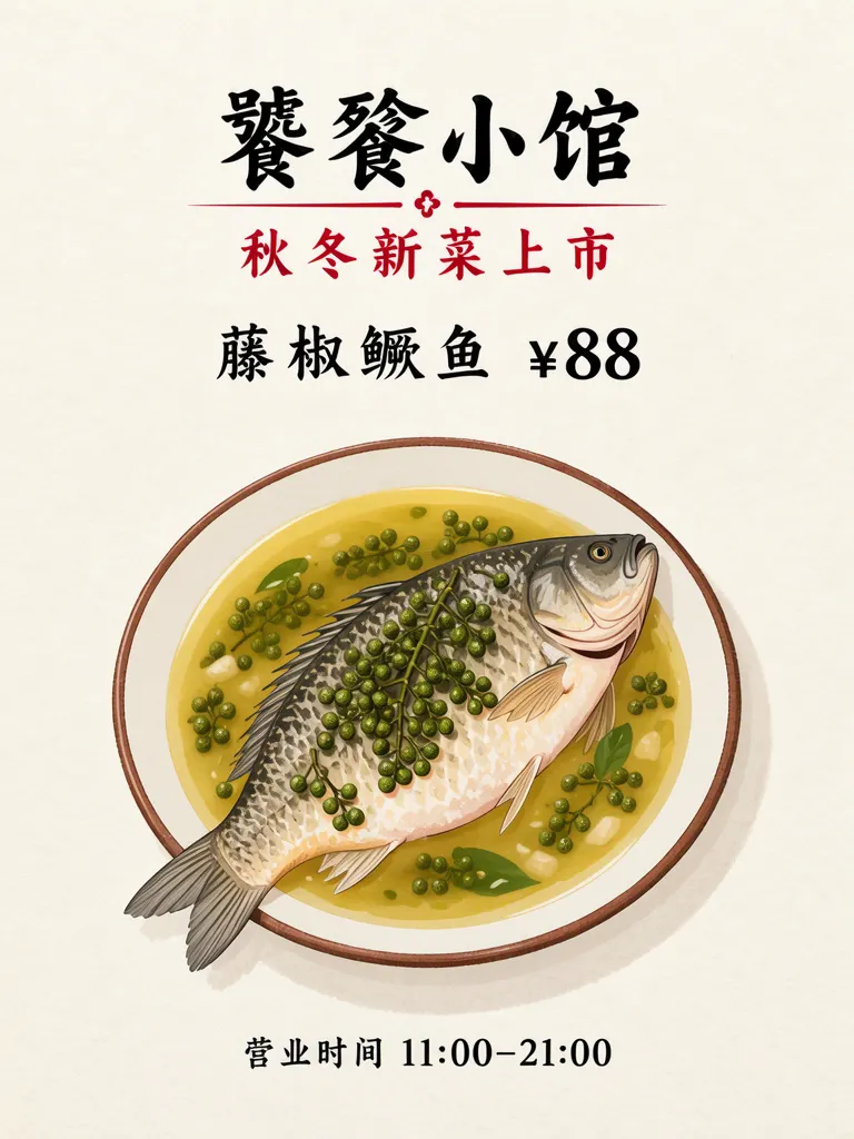
An AI poster with Chinese text can look convincing while a rare character is missing a stroke or has been replaced by a similar form. In our test, both versions came out right, so here is how to check yours: inspect dense characters such as 饕餮 and 鳜 at the size they will be printed, and compare each glyph with a font rendering. The two restaurant posters below use the same seed; only the text size changes.
TL;DR
- Check each rare character separately, enlarged enough to see its strokes.
- Compare the result with a trusted font rendering of the exact wording.
- Verify simplified and traditional forms before approving the image.
- Keep the shop’s real name; make the name box larger instead of substituting an easier word.
Which Chinese characters deserve a closer check?
Prioritize uncommon or visually dense characters, especially in names and dish labels. This example uses 饕餮小馆 (Tāotiè Bistro), 秋冬新菜上市 (New autumn and winter dishes), 藤椒鳜鱼 ¥88 (Sichuan peppercorn mandarin fish, ¥88), and 营业时间 11:00–21:00 (Hours 11:00–21:00). The restaurant, dish, price and hours are made up for the example.
Make one like this Open this image on MOSS Image
Made in the Layout Builder with these boxes:
| Box text or object | Purpose | Rough position |
|---|---|---|
| 饕餮小馆 | Restaurant name | Upper area |
| 秋冬新菜上市 | Seasonal headline | Below the name |
| 藤椒鳜鱼 ¥88 | Dish and price | Middle |
| Fish illustration | Main visual | Center and lower area |
| 营业时间 11:00–21:00 | Hours | Footer |
All four lines came out right on the first try. We checked 饕, 餮 and 鳜 at 3× zoom: no missing or extra strokes, and no traditional form swapped in.
Does making the text larger change the characters?
It can make inspection easier, but size alone does not prove that a character is correct. Both images used the same seed, and the copy and scene stayed the same while the text allocations changed. In the second version, the name and dish line have more room, making the dense glyphs easier to inspect.
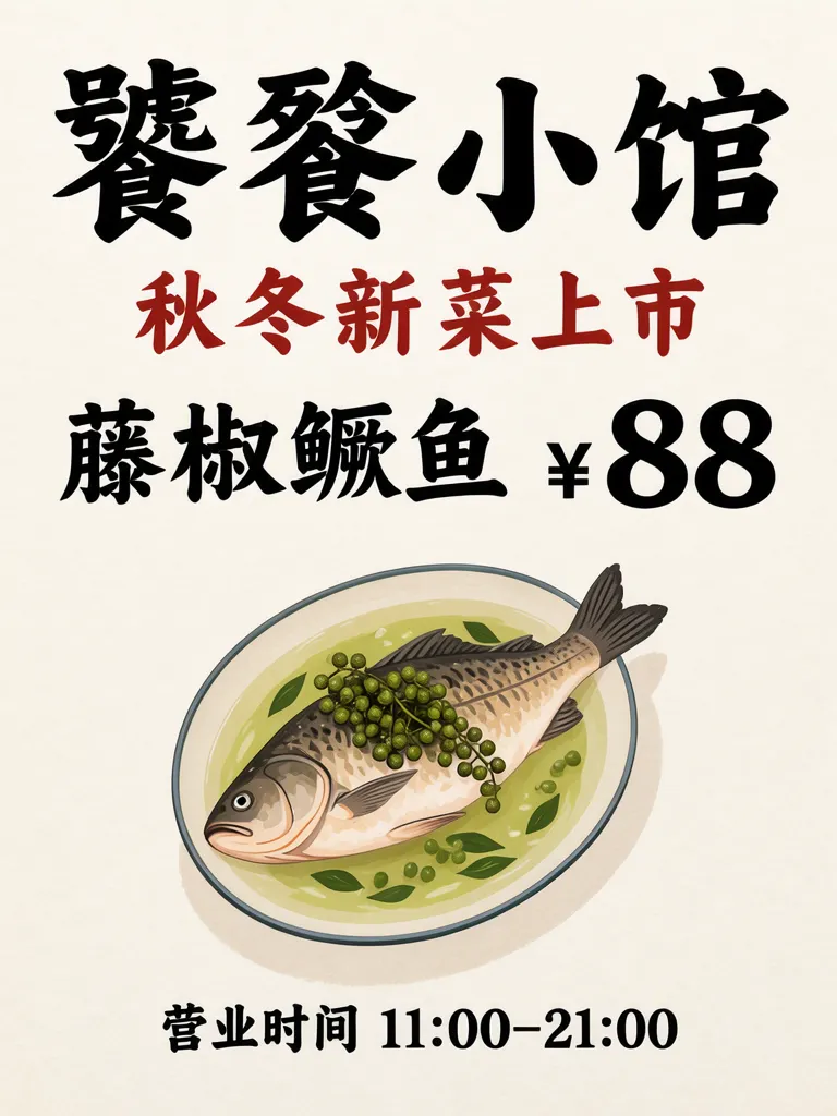
Make one like this Open this image on MOSS Image
Made in the Layout Builder with these boxes:
| Box text or object | Purpose | Rough position |
|---|---|---|
| 饕餮小馆 | Restaurant name, enlarged | Upper area |
| 秋冬新菜上市 | Seasonal headline | Below the name |
| 藤椒鳜鱼 ¥88 | Dish and price, enlarged | Center |
| Fish illustration | Main visual | Center and lower area |
| 营业时间 11:00–21:00 | Hours | Footer |
An explicit text box gives the name and dish line a defined area. The Layout Builder lets us position boxes and enter their copy; MOSS-Image still determines the visual styling. If a small name feels crowded, first give that box more room or simplify nearby decoration.
How can you proofread a Chinese poster character by character?
Use a short comparison routine before printing. The point is to verify the actual character forms, not merely whether the line looks plausible from a distance.
| Check | What to do | Example from this poster |
|---|---|---|
| Exact wording | Copy the approved name and dish into a separate reference | 饕餮小馆; 藤椒鳜鱼 |
| Glyph shape | Zoom each uncommon character and compare strokes | Inspect 饕, 餮 and 鳜 individually |
| Script form | Check simplified versus traditional characters | Confirm 鳜, not a traditional substitute |
| Intended size | View a print proof at the size customers will see | Examine the shop name and dish line |
For a reference, type the approved text in a font you trust and compare one character at a time. If the name matters to the business, have someone who reads Chinese confirm both the characters and the context.
Other generators document the same risk: Ideogram’s text-in-images guide names long text and non-Latin scripts among the harder cases. The check is the same whichever model made the image.
What are the limits of checking rare Chinese text?
Both versions in our test were correct, but a different image can still omit, add or substitute strokes; enlarge the text box and inspect every rare character at intended print size.
We compared a modest size and a larger one; there is no single size that is safe for every poster. The final result depends on the complete composition and output size, so check a physical proof when the poster will be printed. Review punctuation, spacing, currency and operating hours as separate details. If the business uses a traditional name or a regional variant, preserve the approved form exactly rather than simplifying it for the image.
How do you build a Chinese text poster with rare characters?
- Open the Layout Builder and choose a 3:4 canvas. Add separate boxes for the shop name, short headline, dish and price, illustration, and hours.
- Paste the verified wording into each text box, including spaces, punctuation and the intended simplified or traditional forms. Give rare characters a generous box before adding decoration.
- Generate a first version, then inspect each uncommon glyph enlarged. Compare 饕, 餮 or 鳜 with a trusted font rendering and confirm the business name character by character.
- If the name is crowded, enlarge its box and reduce nearby visual detail. Print or preview at the real viewing size and repeat the check.
MOSS Image Studio is an independent hosted studio for the open MOSS-Image model. Not affiliated with OpenMOSS.
FAQ
How can I stop Chinese characters from missing strokes in an AI poster?
Keep each line short, give dense characters enough room and compare the output with the approved text in a familiar font. Proofread at the size people will see.
Should I replace a rare shop name with an easier character?
No. Preserve the real name and adjust the box size or composition. A substitute would change the business name.
How do I check simplified and traditional Chinese in a generated image?
Compare each character with the exact script form in the approved copy. Similar-looking forms can differ in strokes and meaning.
Is a larger text box enough to guarantee correct Chinese text?
No. It makes the text easier to inspect and can give it more room, but each generated result still needs proofreading.
Sources
- Ideogram: Text in Images — Checked on 2026-11-03.
Try it with your own words
Open the Studio, write a brief or lay out boxes on the canvas, and generate with MOSS-Image.