Bilingual Exhibition Poster: Explain Entry Conditions
Plan a bilingual exhibition entrance poster with paired titles, readable dates and venue details, and an admission box visitors can find quickly.
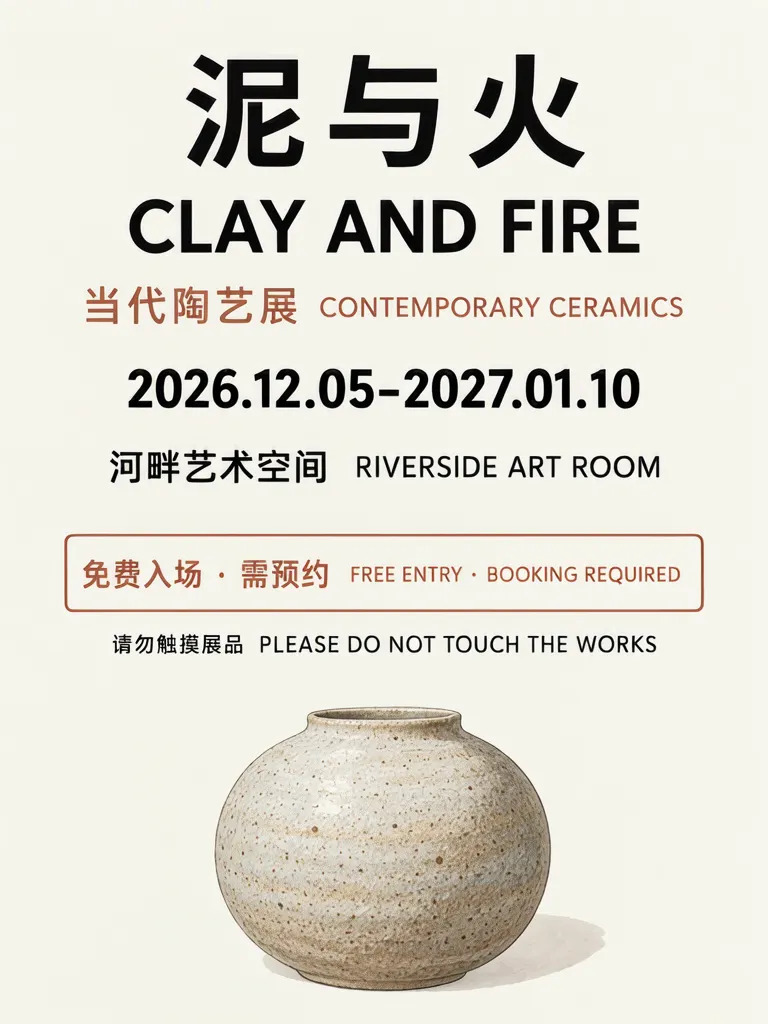
A bilingual exhibition entrance poster should introduce the exhibition in both languages, then give admission conditions their own clearly marked area. We generated a fictional ceramics exhibition poster in a flat layout and as a printed poster on an easel. Both kept all seven required lines on the first try; the venue and exhibition details are invented.
TL;DR
- Put the Chinese and English title first.
- Give dates and venue distinct, readable lines.
- Place admission conditions in a separate box.
- Check that a wrapped date range still reads as one range.
What should an exhibition entrance poster explain?
Start with the title pair, then provide the practical entry details. The example names “泥与火 / CLAY AND FIRE,” gives a date range and venue, and places “免费入场 · 需预约 / FREE ENTRY · BOOKING REQUIRED” inside a terracotta outline. A separate small line says “请勿触摸展品 / PLEASE DO NOT TOUCH THE WORKS.” These are example details, not rules for real museums.
Make one like this Open this image on MOSS Image
Made in the Layout Builder with these boxes:
| Box text / object | Purpose | Approximate position |
|---|---|---|
| 泥与火 | Main Chinese title | Top, large |
| CLAY AND FIRE | English title | Below title |
| 当代陶艺展 CONTEMPORARY CERAMICS | Exhibition type | Upper middle |
| 2026.12.05-2027.01.10 | Date range | Middle |
| 河畔艺术空间 RIVERSIDE ART ROOM | Venue | Middle |
| 免费入场 · 需预约 FREE ENTRY · BOOKING REQUIRED | Admission terms | Outlined box |
| 请勿触摸展品 PLEASE DO NOT TOUCH THE WORKS | Visitor reminder | Small line below |
| Speckled stoneware vase | Illustration | Lower area |
All seven required lines were right on the first try, with the admission sentence inside its outlined box and the visitor reminder below it.
How does the poster read in a gallery entrance photo?
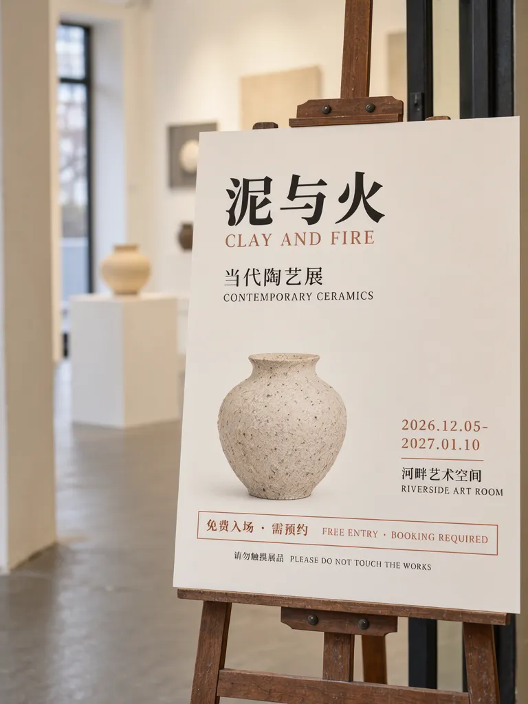
A photo can show the poster in context, but the information still needs a clear reading order. We generated the same copy on an easel. The seven lines were correct first try and no wall labels appeared. The dates and venue moved into a right-hand column, and the date range wrapped as “2026.12.05-” and “2027.01.10.” Check that a range split over two lines still reads as one continuous span before using a similar design. The vase also came out photographic rather than drawn.
Make one like this Open this image on MOSS Image
Made in prompt mode with this exact prompt:
Photograph of a printed exhibition poster on a wooden easel at the entrance of a small gallery, white walls and a plinth softly blurred behind, the poster flat and in sharp focus. Warm off-white paper, black and terracotta type, a speckled stoneware vase drawn in the lower half, the admission line inside an outlined terracotta box. No wall labels or other posters in view. The printed piece holds only the quoted text, and nothing else in view carries any writing: no other signs, labels, stickers or notes. Text, render exactly and add nothing else: title '泥与火'; line 'CLAY AND FIRE'; subtitle '当代陶艺展 CONTEMPORARY CERAMICS'; dates '2026.12.05-2027.01.10'; venue '河畔艺术空间 RIVERSIDE ART ROOM'; boxed line '免费入场 · 需预约 FREE ENTRY · BOOKING REQUIRED'; small line '请勿触摸展品 PLEASE DO NOT TOUCH THE WORKS'.
Which information deserves its own box?
Admission terms should be visually separate from the title and venue because visitors may need to act on them before entering. A border or contrasting fill can make the condition easy to find, while the date and venue remain in the event-information group. Keep a short visitor reminder distinct so it is not mistaken for an admission condition.
| Information | Example copy | Layout treatment |
|---|---|---|
| Title | 泥与火 / CLAY AND FIRE | Largest, first |
| Event type | Contemporary ceramics | Subtitle |
| When and where | Date range and venue | Separate lines |
| Entry condition | Free entry, booking required | Own outlined box |
| Visitor reminder | Please do not touch the works | Small line below |
What should you proofread before printing?
Check the title pair, date endpoints, venue spelling and every admission condition against the organizer's approved information. If dates wrap, read both lines together and confirm neither endpoint or separator is missing. Verify that “free entry” and “booking required” have the intended relationship in both languages. Inspect the small reminder at the size and position where visitors will read it. The example's rules describe only this fictional exhibition; use the actual venue's confirmed instructions for a real event.
How do you make a bilingual exhibition poster?
- Write the Chinese and English title as a pair, then prepare dates, venue, entry conditions and one short visitor reminder.
- In the Layout Builder, place admission terms in their own box. Use the AI poster generator if you want an easel or gallery scene.
- Keep the date range on one line when possible; if it wraps, check the full start-to-end range together.
- Compare every line with the organizer's approved wording. The exact-text guide offers a review checklist.
MOSS Image Studio is an independent hosted studio for the open MOSS-Image model. Not affiliated with OpenMOSS.
FAQ
What information belongs at an exhibition entrance?
Show the exhibition name, dates, venue and the conditions visitors need to know before entry. Keep reminders such as handling instructions separate from booking terms.
Should admission rules be bilingual?
If visitors read both languages, provide matching versions and check that neither translation changes the condition.
What if the date range wraps onto two lines?
Read the lines together and verify that the start date, end date and range separator are all clear.
Try it with your own words
Open the Studio, write a brief or lay out boxes on the canvas, and generate with MOSS-Image.