How to Create a Text-Only Xiaohongshu Reading Cover
Plan a text-only Xiaohongshu reading cover with a clear Chinese headline, short supporting lines, practical layout choices, and an app-preview check.
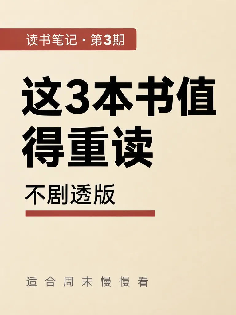
A text-only Xiaohongshu reading cover uses a strong headline and a few supporting lines to tell readers what the note is about before they open it. We made two 3:4 examples with the same Chinese copy: a series label, “These three books are worth rereading,” “No spoilers,” and “Good for a slow weekend read.” The names and reading claims are example copy, not a recommendation list.
TL;DR
- Keep the headline short enough to hold together on one line.
- Use a series label and one useful supporting line, not a paragraph.
- Check the finished cover in the app's own preview; no platform ratio or crop rule is asserted here.
- Compare every Chinese character with the copy you approved.
What should a text-only reading cover say?
Lead with the takeaway a reader can understand at a glance. The example headline “这3本书值得重读” means “These three books are worth rereading.” The small lines read “读书笔记 · 第3期” (“Reading notes · Issue 3”), “不剧透版” (“Spoiler-free version”), and “适合周末慢慢看” (“Good for a slow weekend read”). Together, they identify the series, the promise, and the mood without needing a picture.
The wording and book count are invented examples. We used a layout version and a text-only type version.
Make one like this Open this image on MOSS Image
Made in the Layout Builder with these boxes:
| Box text | Purpose | Approximate position |
|---|---|---|
| 读书笔记 · 第3期 | Series label | Upper left, in a red tab |
| 这3本书值得重读 | Main headline | Centre, large, two lines |
| 不剧透版 | Format note | Below headline |
| (underline bar) | Accent | Below the text |
| 适合周末慢慢看 | Supporting line | Lower area |
All four required lines came out right on the first try. The headline broke as “这3本书值 / 得重读,” splitting 值得 across lines. To keep a phrase intact, shorten the headline or specify the line break you want when you draw the box.
How do you keep the headline readable?
Make the main claim one short phrase and reserve a separate line for context. The second cover uses the same words but puts them on a cream block against deep green. The headline stays on one line, and there are no pictures.
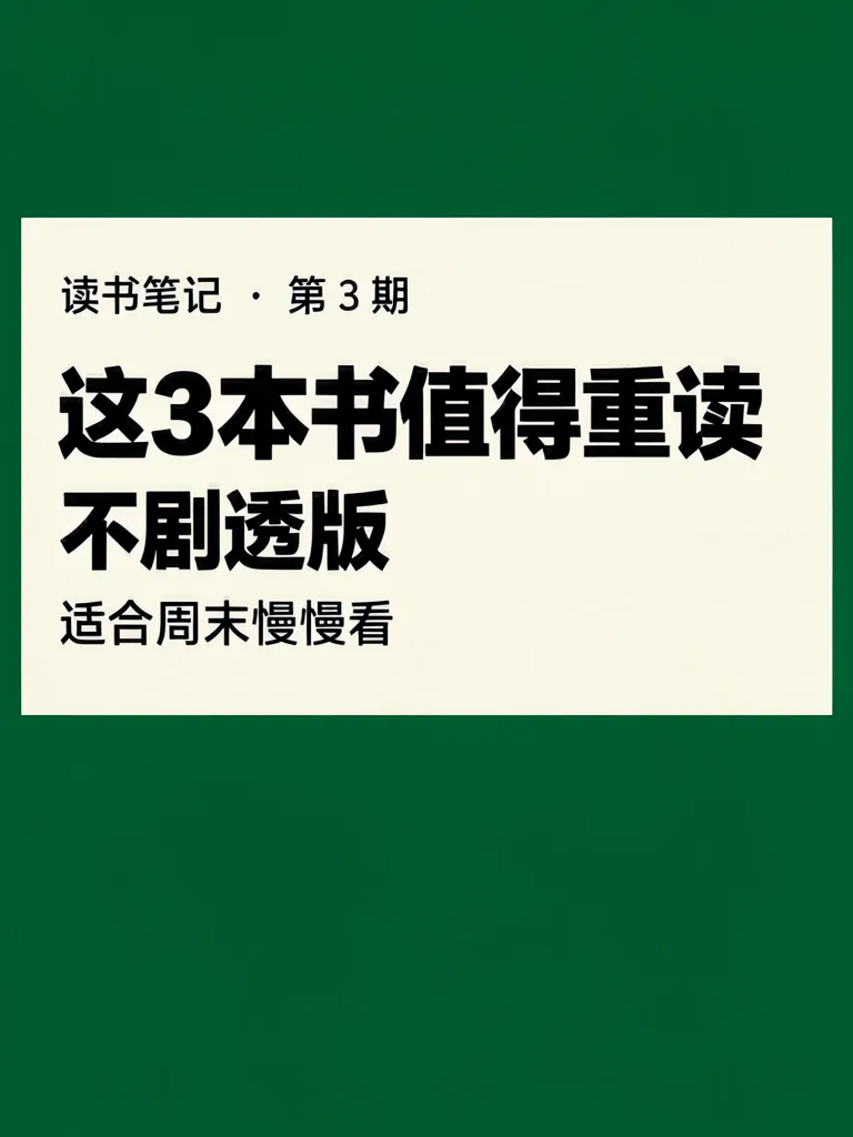
Make one like this Open this image on MOSS Image
Made in prompt mode with this exact prompt:
Text-only social media cover, typography and flat colour only, no pictures or icons: a deep green background, a cream rectangle filling the upper two thirds, the headline huge and heavy in black on the cream, the other lines smaller below. The poster holds only the quoted text: no logo, no signature and no other words. Text, render exactly and add nothing else: small top line '读书笔记 · 第3期'; headline '这3本书值得重读'; line '不剧透版'; small line '适合周末慢慢看'.
All four lines were right on the first try, and the image contains no pictures. The cream block fills about the middle half rather than the upper two thirds, leaving broad green bands above and below. That changes the balance, so check whether your title still dominates when the visual block is smaller than expected.
Which layout is easier to scan?
Both can work; choose based on how much control you want over separate text areas.
| Version | What it does well | What to inspect |
|---|---|---|
| Layout Builder | Gives the headline and supporting copy separate boxes | Keep a phrase together when it wraps |
| Written prompt | Describes the overall typographic treatment in one instruction | Check the balance of the colour block and headline |
For a cover with an issue label, main title and short promise, three distinct text roles are enough. A long subtitle competes with the main point; move extra explanation into the post itself. If the title is long and the reader still needs a date and a venue, the book-club discussion poster shows where that title may break. When the same title has to work across several visual directions rather than one, the three poetry cover prompts compare a typographic, an abstract and an illustrated treatment of one made-up title.
What should you check before posting?
Read the headline at the size it appears in the app preview, then compare the other lines character by character. Our layout version split 值得 across lines, while the prompt version's cream block occupied less space than requested. Those are the two concrete points to inspect: phrase breaks and the balance between text and colour.
Upload a draft and check it in the app's own preview. This topic's research did not confirm a platform ratio, size, or crop rule from primary documentation, so none is stated here.
How can you make your own text-only reading cover?
- Choose a short headline that expresses the reading note's main idea. Keep a separate series label and one supporting line.
- For fixed text areas, open the Layout Builder and make boxes for the series, headline and supporting line on a 3:4 canvas, as in our layout example.
- For a typographic treatment, use the AI poster generator, describe the background and colour block, then quote each Chinese line exactly. The exact-text guide covers separating scene instructions from copy.
- Check the line break and all four strings, then upload a draft and inspect the actual app preview.
MOSS Image Studio is an independent hosted studio for the open MOSS-Image model. Not affiliated with OpenMOSS.
FAQ
What should I put on a reading-note cover?
Use a short idea-led headline, then a series label or brief note such as “spoiler-free.” Put explanations in the post body.
How do I stop a Chinese phrase breaking in the wrong place?
Shorten the headline or specify the intended line break in the layout instructions. Inspect the rendered phrase as a whole.
What size should a Xiaohongshu cover be?
This post does not state a platform size or ratio because none was confirmed from primary documentation. Check your draft in the app's own preview.
Try it with your own words
Open the Studio, write a brief or lay out boxes on the canvas, and generate with MOSS-Image.