How to Design Independent Podcast Episode Cards Clearly
Build a square podcast card with a show name, episode number and title. Compare layout and illustration approaches, and inspect blank props for stray text.
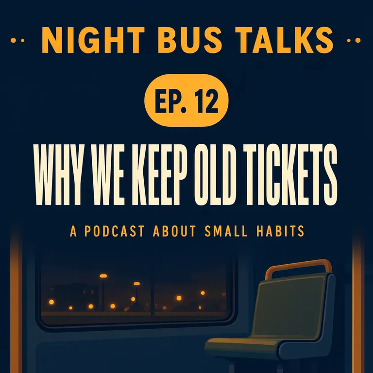
A podcast episode card gives a show name, an episode number and a title a clear order on one square graphic. Our invented show, NIGHT BUS TALKS, uses “EP. 12” and the episode title “WHY WE KEEP OLD TICKETS,” with a short description of the show. The examples are fictional and do not refer to a real podcast or host.
TL;DR
- Put the show name, episode number and episode title in distinct positions.
- Keep a short tagline smaller than the episode title.
- Avoid asking a ticket or receipt illustration to carry realistic printed details.
- Inspect every text-like object, not only the headline.
What information belongs on an episode card?
Start with the show identity, episode number and episode title. Add a short descriptor only if it helps someone understand the subject. In our example, “NIGHT BUS TALKS” is the show, “EP. 12” identifies the installment, “WHY WE KEEP OLD TICKETS” is the episode title and “A PODCAST ABOUT SMALL HABITS” describes the program. These words are invented examples, not a real show listing.
Make one like this Open this image on MOSS Image
Made in the Layout Builder with these boxes:
| Box text / object | Job | Approximate position |
|---|---|---|
| NIGHT BUS TALKS | Show name | Top |
| EP. 12 | Episode marker | Upper middle, amber rounded box |
| WHY WE KEEP OLD TICKETS | Episode title | Middle |
| A PODCAST ABOUT SMALL HABITS | Short descriptor | Lower middle |
| Empty bus seat by a window | Illustration | Lower area |
All four required lines were correct on the first try. The episode number landed in an amber rounded box rather than the requested circle, but it remains easy to distinguish from the title. If a specific shape is part of your visual identity, inspect that detail along with the words.
What changes when the card uses an illustrated scene?
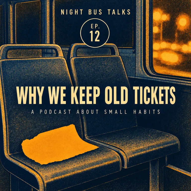
The second version places a small paper stub on an empty bus seat beside a window. The accepted image is the second try. On try 1, the ticket was meant to be blank but gained fake fields and garbled writing, including “B ICEN,” “DEPTA,” “0:300,” and mirrored text. Tickets, receipts and labels normally carry print, so they invite invented marks even when the prompt calls them blank.
Make one like this Open this image on MOSS Image
Made in prompt mode with this exact prompt:
Square podcast episode cover, risograph-style illustration of an empty night bus seat beside a window with blurred city lights, grainy amber and navy inks, a small torn paper stub lying on the seat that is a solid amber shape with nothing printed on it, the show name at the top, the episode number small in a circle, the episode title large across the middle. Nothing in the drawing carries numbers or writing. The poster holds only the quoted text: no logo, no signature and no other words. Text, render exactly and add nothing else: top line 'NIGHT BUS TALKS'; circle 'EP. 12'; title 'WHY WE KEEP OLD TICKETS'; small line 'A PODCAST ABOUT SMALL HABITS'.
Try 2 replaced the ticket with a plain solid amber stub and specified that nothing in the drawing carries numbers or writing. All four lines were correct, and the stub is plain. The episode marker now breaks over two lines inside the circle, “EP.” above “12”, so check that the badge still reads as one unit at display size. This is a useful prompt adjustment when a familiar printed object is likely to attract stray text: make it a solid shape and state directly that it is blank.
| Approach | Strength | Check |
|---|---|---|
| Layout Builder | Separate boxes make the information order explicit | Whether the episode marker and title have the intended visual hierarchy |
| Written prompt | Adds an illustrated scene and mood around the same copy | Whether objects in the illustration contain invented marks |
How should you proof an episode card?
Read the show name, number and title against the final episode details. Then inspect small labels and props in the scene, especially anything shaped like a ticket, sign, label or screen. A clean headline does not guarantee the background objects are blank. Our shared illustration passed that check after the second try, while the first ticket version did not.
Also look at the overall hierarchy when the graphic is reduced to the size where people will encounter it. The episode title should be easy to identify, with show identity and number still legible. If the title disappears at a small display size, simplify the background or shorten the wording before generating another version.
How can you make an episode card for your show?
- Prepare four lines at most: show name, episode number, episode title and an optional short descriptor. Keep the title as the main reading element.
- We used a 1:1 square canvas. In the Layout Builder, draw distinct boxes for the four text elements and the illustration.
- For a scene, use the AI poster generator, quote each line and describe props as blank solid forms when they should carry no print. The exact-text guide has more advice on checking quoted copy.
- Compare each line with the episode details, then zoom into ticket-like and label-like objects for stray marks. Reduce the image to its expected display size to check the title hierarchy.
MOSS Image Studio is an independent hosted studio for the open MOSS-Image model. Not affiliated with OpenMOSS.
FAQ
What should go on a podcast episode card?
Use the show name, episode number and title. Add a brief show description only when it clarifies the subject.
Should the episode number be larger than the title?
Usually the episode title carries the main message. Keep the number easy to find, while making the title the strongest reading element.
Why does an image generator add writing to a blank ticket?
Tickets and similar objects are commonly printed in real life, so a model may invent fields or marks. Describe the object as a plain blank shape and inspect the result closely.
Should each episode use the same cover design?
A consistent layout can help listeners recognize a series. Keep the show name in a predictable place while changing the episode title and optional artwork.
Try it with your own words
Open the Studio, write a brief or lay out boxes on the canvas, and generate with MOSS-Image.