AI poster small print blur: check size before print
Our same-seed yoga flyers stayed sharp, but the compact footer was hard to read as a thumbnail. Learn how to size, preview and proof small print.
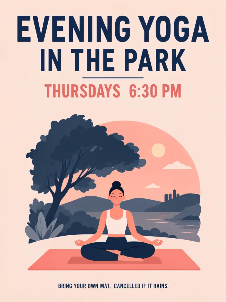
Small print in an AI poster can be technically correct and still too hard to read at the size people see it. Neither of our two yoga flyers blurred, but the compact footer is hard to read as a thumbnail. Both flyers used the same seed; only the footer box changed. Give small print its own box with room, then check it at the intended phone or print size instead of judging only a zoomed image.
TL;DR
- Put a long footer in its own box and leave enough room around it.
- Check the message at the size people will actually see.
- Compare the complete line, not only whether the letters look sharp.
- Shorten wording only after confirming which details can be removed.
Can small print be correct but still unreadable?
Yes. Correct spelling and practical readability are separate checks. Our sample yoga flyer has the footer “BRING YOUR OWN MAT. CANCELLED IF IT RAINS.” The event details are made-up examples; the scene shows an evening yoga illustration under a tree.
Make one like this Open this image on MOSS Image
Made in the Layout Builder with these boxes:
| Box text or object | Purpose | Rough position |
|---|---|---|
| EVENING YOGA | Main headline | Top |
| IN THE PARK | Second headline line | Upper area |
| THURSDAYS 6:30 PM | Schedule | Middle |
| Yoga figure under a tree | Illustration | Center |
| BRING YOUR OWN MAT. CANCELLED IF IT RAINS. | Conditions | Narrow footer |
All four required text lines were spelled correctly in this version. The long footer is set very small against the bottom edge: readable at full size but hard to read as a thumbnail. The letters are sharp; the problem is their size at the scale people will see.
What changes when the footer gets more room?
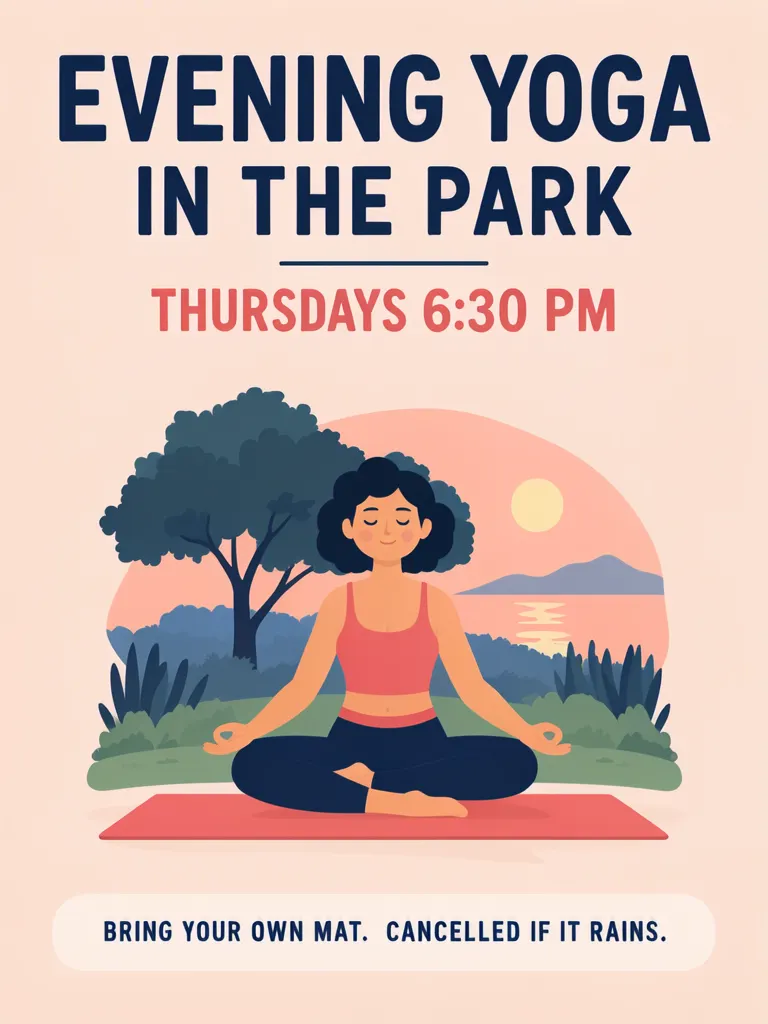
In the second version, the same footer has a taller and wider area, so its text appears larger and easier to read. Both images used seed 8901; the footer allocation changed. The illustration also changed between images, so compare the footer rather than assuming every decorative detail is held constant.
Make one like this Open this image on MOSS Image
Made in the Layout Builder with these boxes:
| Box text or object | Purpose | Rough position |
|---|---|---|
| EVENING YOGA | Main headline | Top |
| IN THE PARK | Second headline line | Upper area |
| THURSDAYS 6:30 PM | Schedule | Upper middle |
| Yoga figure under a tree | Illustration | Center |
| BRING YOUR OWN MAT. CANCELLED IF IT RAINS. | Conditions | Taller, wider footer |
The layout gives the conditions line its own region. This does not set a universal minimum font size: the useful question is whether the complete line can be read at the intended display size. If it cannot, enlarge the footer region, simplify nearby artwork or edit the wording with the event organizer’s approval.
How should you check small print before sharing a poster?
Use the actual viewing context as your test. A full-resolution zoom helps inspect letter shapes, but it can hide the fact that a footer becomes too small on a phone screen or a printed page viewed from a normal distance.
| Viewing check | What to inspect | What to change if it fails |
|---|---|---|
| Thumbnail or phone preview | Can the whole footer be read without zooming? | Give it more height and width |
| Print-size proof | Are the words distinguishable at normal viewing distance? | Rework the footer allocation or simplify the scene |
| Text comparison | Does each word and punctuation mark match the source? | Correct the copy and generate a new version |
| Whole composition | Does the footer have contrast and breathing room? | Reduce competing detail near the bottom |
For an event notice, separate the conditions into short clauses before writing the image copy: what to bring, what happens in rain, and where to find more information. Keep essential instructions together. Do not shrink important safety or cancellation details just to preserve decoration.
Does a larger footer guarantee crisp small text?
No. Our samples were not blurred, and the compact one was hard to read mainly because of its size at thumbnail scale; inspect each new result in its own viewing context.
This comparison changes the space given to the footer, not the wording. It does not establish a minimum font size or guarantee legibility for another design. Long sentences, low contrast, thin lettering and a reduced display can all make reading harder. Proofread the words and punctuation separately from the visual-size check.
Other generators document the same limit: Ideogram’s text-in-images guide names long text among the harder cases. We did not test Ideogram for this post.
How do you build a flyer with readable conditions?
- Choose a 3:4 canvas in the Layout Builder. Put the headline and schedule in separate boxes, then reserve one wide footer box for the complete condition line.
- Enter only the organizer-approved instructions. If the footer is long, first give it more space and reduce nearby illustration detail rather than compressing the words.
- Generate the flyer and check both spelling and visual size. Open the image at the phone size where it will be shared, then make a print-size proof if it will be printed.
- If you want to start from a written scene, use the AI poster generator and describe the footer as a distinct band. See how the Layout Builder uses text boxes for another way to plan placement.
MOSS Image Studio is an independent hosted studio for the open MOSS-Image model. Not affiliated with OpenMOSS.
FAQ
How small can the text on a flyer be?
There is no single size that works for every layout and viewing distance. Preview the flyer at the size people will see and make a print proof when relevant.
What information belongs in a poster footer?
Put secondary but necessary details there, such as conditions or instructions, while keeping them large and clear enough to read. Keep the main date and time more prominent.
Should I shorten a long disclaimer on a poster?
Only after confirming the shorter wording preserves the organizer’s intended meaning. You can also allocate a larger region to the full line.
How can I tell whether text is blurry or merely too small?
Compare the letter shapes at full size and then view the whole image as a thumbnail or at print size. Sharp letters can still be too small for the intended use.
Sources
- Ideogram: Text in Images — Checked on 2026-11-03.
Try it with your own words
Open the Studio, write a brief or lay out boxes on the canvas, and generate with MOSS-Image.