Two-Column Bilingual Poster Layouts in Layout Builder
Compare subtitle and aligned-column bilingual posters, view the Layout Builder boxes and JSON, and check translations and phone-size readability.
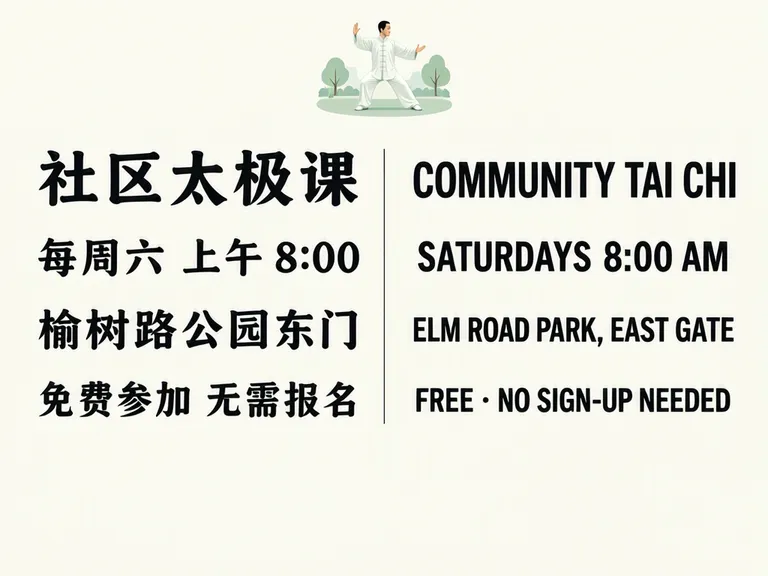
A two-column bilingual poster puts each translation on the same row, so readers can compare matching details without scanning between a headline and a subtitle. In our 4:3 tai chi example, Chinese sits on the left and English on the right, with the title, weekly time, location and attendance note paired line by line. A subtitle version suits a Chinese-led audience; aligned columns give both languages more equal weight.
TL;DR
- Use subtitles when one language leads and the other is supporting context.
- Use aligned columns when readers need to compare each detail in either language.
- Keep matching lines on the same row and test the smallest text at phone size.
- Leave breathing room below the last row instead of stretching the content to fill the page.
When is a subtitle layout enough?
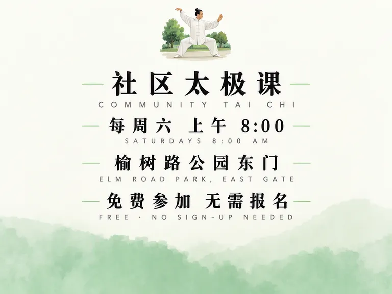
A subtitle layout works when most readers follow one language and the second line is a translation or prompt. Our first image stacks English in small, widely spaced letters directly beneath each Chinese line. The Chinese copy reads “社区太极课” (Community Tai Chi), “每周六 上午 8:00” (Saturdays at 8:00 AM), “榆树路公园东门” (East Gate of Elm Road Park), and “免费参加 无需报名” (Free; no sign-up needed). This lets the Chinese line lead visually, while still giving an English reader a translation.
The class, park, schedule and free entry in these examples are made up.
Make one like this Open this image on MOSS Image
Made in the Layout Builder with these boxes:
| Box text | Purpose | Rough position |
|---|---|---|
| Small tai chi figure in a park | Illustration | Top centre |
| 社区太极课 / COMMUNITY TAI CHI | Class name and subtitle | Upper middle, Chinese above English |
| 每周六 上午 8:00 / SATURDAYS 8:00 AM | Schedule | Middle, Chinese above English |
| 榆树路公园东门 / ELM ROAD PARK, EAST GATE | Location | Lower middle, Chinese above English |
| 免费参加 无需报名 / FREE · NO SIGN-UP NEEDED | Entry information | Bottom of text block, Chinese above English |
All eight lines appeared correctly in this test. The trade-off is visible in the image: the English subtitles are small and letter-spaced, so they are harder to read than the Chinese. If both language groups need to find their own details quickly, equal placement is a better starting point.
When should you align two language columns?
Align columns when readers need to compare details or either language must stand on its own. The second image keeps the same copy and illustration, but places Chinese on the left and English on the right. A thin vertical rule separates the columns, while each pair of lines shares a row.
Make one like this Open this image on MOSS Image
Made in the Layout Builder with these boxes:
| Box text | Purpose | Rough position |
|---|---|---|
| Small tai chi figure in a park | Illustration | Top centre |
| 社区太极课 | Chinese title | Upper left |
| COMMUNITY TAI CHI | English title | Upper right, aligned with Chinese title |
| 每周六 上午 8:00 / SATURDAYS 8:00 AM | Schedule pair | Middle row, left and right columns |
| 榆树路公园东门 / ELM ROAD PARK, EAST GATE | Location pair | Lower-middle row, left and right columns |
| 免费参加 无需报名 / FREE · NO SIGN-UP NEEDED | Entry pair | Last text row, left and right columns |
| Thin vertical divider | Column separator | Between columns |
The eight lines were correct and both languages were readable at the generated size. The lower third is empty. That open area is part of the actual composition; add another useful detail only if the event has one, rather than inserting filler to occupy space.
The source layout JSON for columns-layout records the overall composition and its paired boxes. Here is a trimmed excerpt with the summary and the first three text boxes:
{
  "summary": {
    "meta": ["poster"],
    "canvas": "single",
    "caption": "Bilingual community tai chi poster, flat design on warm white, ink black with a jade green accent, Chinese in the left column and English in the right column, each pair on the same row"
  },
  "items": [
    {
      "label": "object",
      "caption": "small flat illustration of a tai chi figure in a park, centred at the top",
      "bbox": [-370, -90, -230, 90]
    },
    {
      "label": "text",
      "caption": "left column, Chinese, ink black, bold title",
      "text": "社区太极课",
      "bbox": [-190, -470, -110, -30]
    },
    {
      "label": "text",
      "caption": "right column, English, ink black, same size and baseline as the Chinese, bold title",
      "text": "COMMUNITY TAI CHI",
      "bbox": [-190, 30, -110, 470]
    }
  ]
}
The table describes the intended boxes, while the generated result shows how MOSS-Image interpreted them. In the Layout Builder, you can draw text and object boxes, enter their content and see the layout JSON update. Boxes guide placement; the model still chooses exact styling. The JSON layout guide explains the format. For bilingual wording and punctuation, our exact-text guide is also useful.
Which layout is easier to read?
Choose by how readers will use the poster. A subtitle arrangement makes one language prominent; aligned columns make comparison more direct.
| Layout | Suits | Second-language readability |
|---|---|---|
| Chinese with English subtitles | A Chinese-led audience that needs supporting English | Lower in this example: smaller and widely letter-spaced |
| Chinese and English columns | Readers who may approach from either language | Higher in this example: matching rows and similar visual weight |
Neither arrangement removes the need to proofread. A column can be too narrow for a long place name, and a small translation can become difficult to read when the poster is shown on a phone. Check the finished image at the size and distance people will use.
What should you check before sharing or printing?
Check the pairings first: every Chinese line should sit across from its intended English meaning, not merely beside a line of similar length. Then check names, times, punctuation and the address character by character. Our test rendered all eight lines correctly in both versions; the subtitle version's English was hard to read, and the aligned-column version left the bottom third empty.
For an event notice, ask a fluent reader of each language to read only their column and confirm the details independently. On a phone, open the image at its normal feed size. For print, make a proof at the intended dimensions and verify that the columns and divider remain distinct. Adjust box width or shorten a phrase only after confirming that the shorter wording preserves the meaning.
How do you build a bilingual two-column poster?
- In the Layout Builder, choose a 4:3 canvas and start with a top illustration box, a Chinese left column, an English right column and one divider.
- Put one translation pair on each row. Use the same vertical range for both boxes, and leave enough horizontal room for the longer version of each line.
- Add the exact schedule, place and attendance wording; avoid adding a translation from memory when the event has approved copy.
- Generate and inspect the longest line in each language, then check the small text on a phone-sized preview. Compare with the JSON layout guide if you need to inspect or save the box structure.
MOSS Image Studio is an independent hosted studio for the open MOSS-Image model. Not affiliated with OpenMOSS.
FAQ
Should the English translation go below or beside Chinese?
Put it below when Chinese is the primary reading path and English is supporting context. Put it beside the Chinese when readers should compare the details or either language should be equally easy to find.
How do I keep bilingual poster lines aligned?
Write each translation pair as one row in the layout plan. Give both boxes the same vertical position, then check the longest phrase in each language after generation.
Is a bilingual poster better as two columns?
Two columns are useful for parallel reading, but they need space for the longer language. A subtitle layout can use less horizontal room and make one language clearly primary.
What should I check on a bilingual event poster?
Check that the translations match, then verify names, dates, times, address details and the size of the smallest text at its intended viewing size.
Sources
- MOSS-Image user guide: layout prompts — Checked on 2026-11-03.
Try it with your own words
Open the Studio, write a brief or lay out boxes on the canvas, and generate with MOSS-Image.