Bilingual Takeaway Menus: Pair Dish Names and Prices
Learn how to pair Chinese and English dish names with the right prices on a takeaway menu, compare stacked rows with columns, and proofread the result.
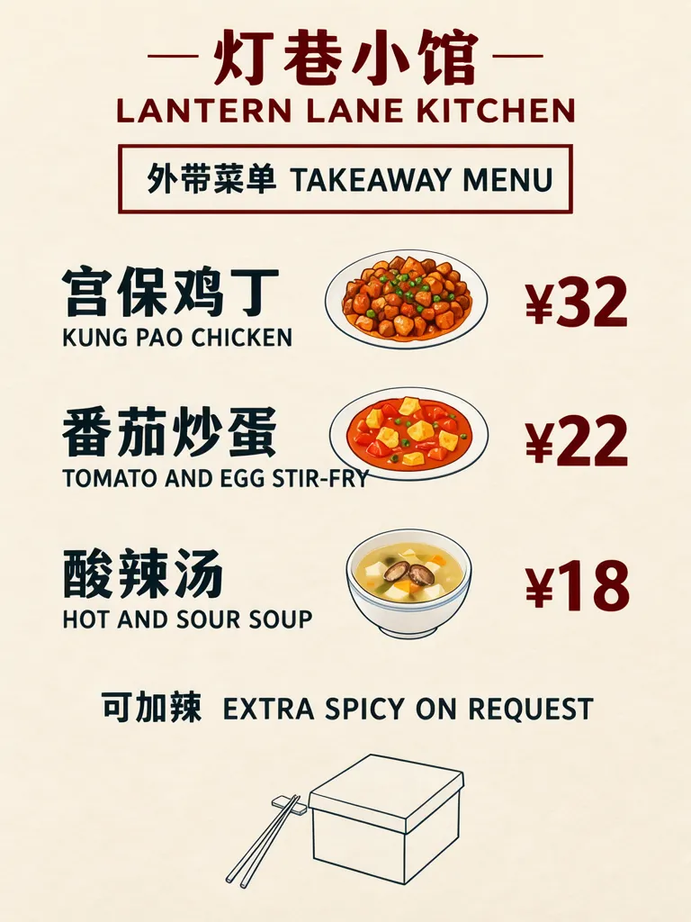
A bilingual takeaway menu is easiest to scan when each Chinese dish name is paired with its English name first, with the price aligned beside that pair. We generated two versions of the same three-dish menu: a structured layout and a printed-card scene. Both kept all 13 required lines and the dish-name pairs.
TL;DR
- Put each Chinese name directly above its English name.
- Align one price with each paired name.
- Keep notes such as spice options below the dish rows.
- Check added drawings do not crowd a translation.
How should a bilingual takeaway menu pair dish names and prices?
Pair the names before deciding where the price sits. A reader should see one dish as a unit: Chinese name, English name, then its corresponding price. This is especially useful on a short menu where customers compare dishes quickly. The restaurant, names and prices in these examples are invented.
Make one like this Open this image on MOSS Image
Made in the Layout Builder with these boxes:
| Box text / object | Purpose | Approximate position |
|---|---|---|
| 灯巷小馆 / LANTERN LANE KITCHEN | Restaurant name pair | Top |
| 外带菜单 TAKEAWAY MENU | Menu title | Upper section |
| 宫保鸡丁 / KUNG PAO CHICKEN / ¥32 | Dish pair and price | First row |
| 番茄炒蛋 / TOMATO AND EGG STIR-FRY / ¥22 | Dish pair and price | Middle row |
| 酸辣汤 / HOT AND SOUR SOUP / ¥18 | Dish pair and price | Lower row |
| 可加辣 EXTRA SPICY ON REQUEST | Spice note | Bottom |
| Noodle box and chopsticks | Illustration | Lower area |
All 13 lines were right on the first try. The model added dish drawings between each name and price; on the tomato row the English name runs close to its plate. If that makes your list feel crowded, say “no pictures between rows.”
What does a printed menu card look like in a counter scene?
A counter scene can show how the card might sit at pickup, while the copy still needs to do the practical work. We generated a warm restaurant-counter photo with the card in focus and plain paper bags nearby. Its 13 lines were right first try, though the bilingual title breaks into two lines, Chinese above English.
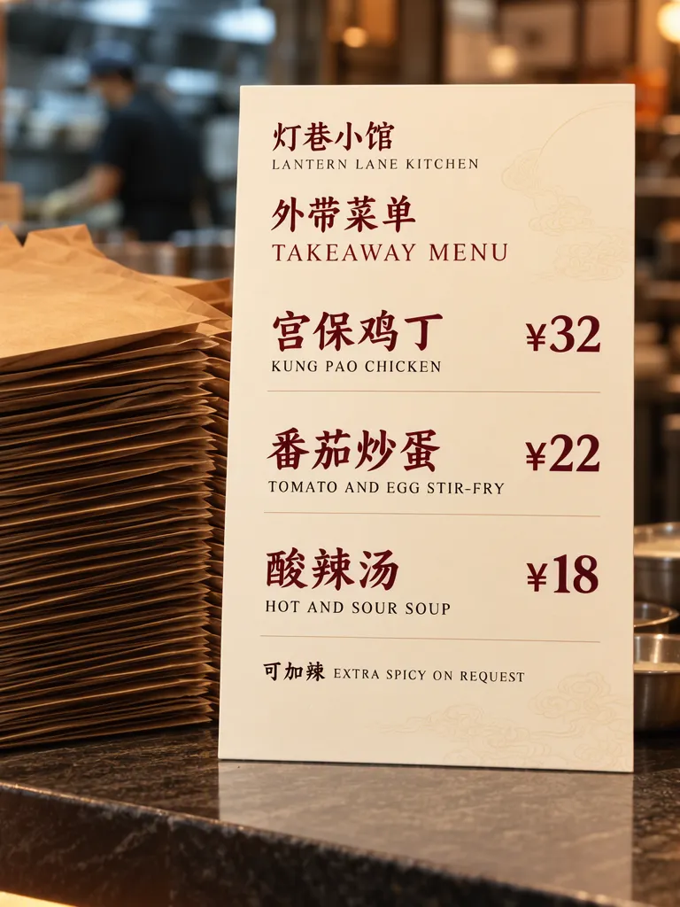
Make one like this Open this image on MOSS Image
Made in prompt mode with this exact prompt:
Photograph of a printed takeaway menu card standing on a restaurant counter beside a stack of plain unprinted brown paper bags, warm light, the kitchen behind softly blurred, the card flat and in sharp focus. Cream card, dark red and charcoal type, three dish rows, each Chinese name with its English name directly underneath and the price on the right of that row. The printed piece holds only the quoted text, and nothing else in view carries any writing: no other signs, labels, stickers or notes. Text, render exactly and add nothing else: top line '灯巷小馆'; line 'LANTERN LANE KITCHEN'; title '外带菜单 TAKEAWAY MENU'; dish '宫保鸡丁'; under it 'KUNG PAO CHICKEN'; price '¥32'; dish '番茄炒蛋'; under it 'TOMATO AND EGG STIR-FRY'; price '¥22'; dish '酸辣汤'; under it 'HOT AND SOUR SOUP'; price '¥18'; note '可加辣 EXTRA SPICY ON REQUEST'.
When is a two-column menu a better fit?
Stacked pairs work when the menu is short and the English line can sit right below the Chinese. A two-column arrangement may suit a longer list where readers compare translations across a page. Our two-column bilingual layout example shows that alternative; for takeaway, choose the structure that keeps each name attached to its own price.
| Layout | Useful when | Check first |
|---|---|---|
| Stacked name pairs | Few dishes, narrow card | English line remains close to its Chinese name |
| Two language columns | Longer list or broad page | Each row still maps clearly to one price |
| Photo scene | Showing a printed card in context | The card itself remains readable at preview size |
What should you proofread before printing?
Read each row from top to bottom, then trace the eye to the price. Confirm the Chinese and English names describe the same dish, and compare every amount with the current menu. Check whether an illustration touches a line, whether a title wraps awkwardly, and whether small notes can be read at the size customers will see. A correct-looking picture is not a substitute for checking the actual menu copy.
How do you make a bilingual takeaway menu?
- Draft one pair per dish: Chinese name first, English directly beneath, then a price aligned with that pair.
- Use the Layout Builder for separate dish rows; use the AI poster generator for a counter-card scene.
- Keep optional notes in a separate small box, and ask for no pictures between rows if drawings crowd the names.
- Check each pair and its price against the approved menu. The exact-text guide explains a practical text review.
MOSS Image Studio is an independent hosted studio for the open MOSS-Image model. Not affiliated with OpenMOSS.
FAQ
Should the English translation go beside or below the Chinese name?
For a compact takeaway card, placing English directly below Chinese makes the pair easy to identify. A two-column format can work when the list is longer and there is room to preserve row alignment.
Should prices use a separate column?
A consistent right edge helps scanning, provided each price remains level with its own dish pair.
How do I prevent a drawing from crowding menu text?
Reserve a clear gap beside the name and price rows, or ask for no pictures between rows.
Try it with your own words
Open the Studio, write a brief or lay out boxes on the canvas, and generate with MOSS-Image.