How to Make Bubble Tea Topping Price Boards Look Clear
Separate base drink prices from paid toppings with clear sections and plus signs, then use this checklist to proofread every amount before display.
A bubble-tea topping board should separate drink prices from add-on prices so customers can tell what the base drink costs and what an extra topping adds. A heading for each section and a leading plus sign on each add-on row make that distinction visible. The shop, drinks and prices in our examples are made up. Both of our images came out right on the first try, so this post is about what to proofread before the board goes up.
TL;DR
- Put base drinks and add-ons under separate headings.
- Start each extra with a plus sign and keep its price on that row.
- Check every amount, plus sign and size option before publishing.
- Keep the add-on panel visually distinct from drink prices.
How should a topping price board separate drinks and extras?
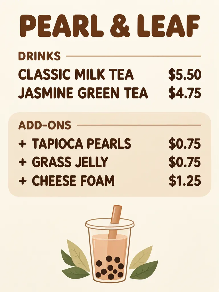
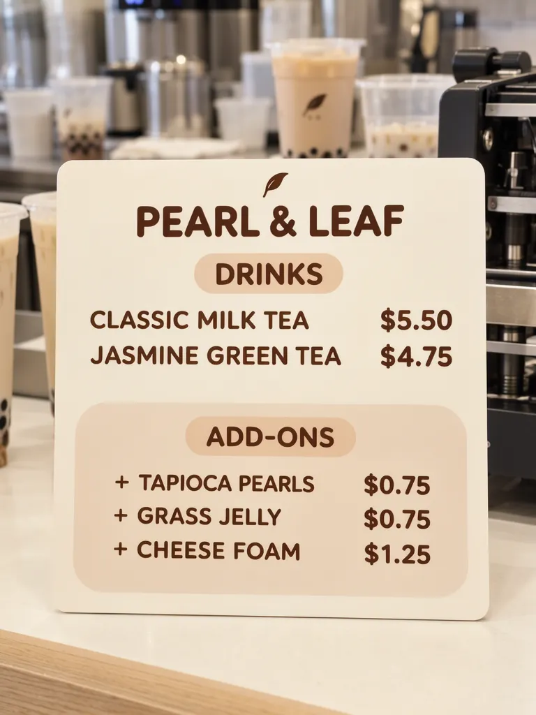
Give the base menu and optional additions separate sections. In this example, Classic Milk Tea costs $5.50 and Jasmine Green Tea costs $4.75. The add-ons are tapioca pearls for $0.75, grass jelly for $0.75, and cheese foam for $1.25. Each extra begins with “+” so its amount reads as an addition rather than a drink price.
Make one like this Open this image on MOSS Image
Made in the Layout Builder with these boxes:
| Box text / object | Job | Approximate position |
|---|---|---|
| PEARL & LEAF | Shop name | Top |
| DRINKS | Base menu heading | Upper section |
| CLASSIC MILK TEA $5.50 | Drink and base price | Upper section |
| JASMINE GREEN TEA $4.75 | Drink and base price | Upper section |
| ADD-ONS | Extra section heading | Lower panel |
| + TAPIOCA PEARLS $0.75 | Optional topping and price | Lower panel |
| + GRASS JELLY $0.75 | Optional topping and price | Lower panel |
| + CHEESE FOAM $1.25 | Optional topping and price | Lower panel |
| Milk tea illustration | Decoration | Bottom |
The first generated layout has all eight required lines correct. The drinks and add-ons sit in separate sections, with the extras inside a tinted panel. That arrangement gives the plus signs context: they introduce optional additions rather than another drink row.
Does a counter photo keep the same distinction?
Yes, the counter version also separates drinks from add-ons, and its eight lines were correct on the first try. The cream board uses warm brown type, with the extra section in a rounded beige panel below the drinks. A small leaf mark appears above the shop name and on a cup in the background; there is no other text.
Make one like this Open this image on MOSS Image
Made in prompt mode with this exact prompt:
Photograph of a printed price board standing on the counter of a small bubble tea shop, cups and a sealing machine softly blurred behind, board in sharp focus. Cream board, warm brown type, base drinks at the top and add-ons in a separate rounded beige panel below. Text, render exactly and add nothing else: name 'PEARL & LEAF'; heading 'DRINKS'; row 'CLASSIC MILK TEA $5.50'; row 'JASMINE GREEN TEA $4.75'; heading 'ADD-ONS'; row '+ TAPIOCA PEARLS $0.75'; row '+ GRASS JELLY $0.75'; row '+ CHEESE FOAM $1.25'.
A photo scene can put the board into a shop setting, while a flat layout gives direct control over the separate groups. For either version, the practical check is whether a customer can tell which numbers are drink prices and which are additions. Keep the plus sign and topping name close to their amount.
| Board part | Example | Customer reads it as |
|---|---|---|
| Drink row | CLASSIC MILK TEA $5.50 | Base drink price |
| Add-on row | + TAPIOCA PEARLS $0.75 | Extra charge for topping |
What should you check before posting the board?
Our two images worked on the first try, but that does not remove the need to proofread. Compare each price with the shop’s current list, confirm every “+” sign is present, and check any size choices the shop actually offers. If the price is for a topping portion, specify that clearly when customers could otherwise assume a different quantity. Look at the board at its real counter or phone display size.
The add-ons in these examples have prices, but the images do not specify sizes or portion quantities. Add that information only if the shop uses it, then make sure it is readable and does not look like another drink price. Our combo menu example covers a different menu problem: one included set and one total price for each combo.
How do you build a topping board with clear add-ons?
- In the Layout Builder, choose a 3:4 canvas and make a DRINKS group followed by an ADD-ONS group.
- Put each base drink and its price on one row. Put each optional topping in its own row beginning with “+”, with the additional amount alongside it.
- For a counter setting, use the AI poster generator with the same two-section hierarchy and quote each line. Keep cups and equipment in the blurred background, not over the menu text.
- Proofread every amount and plus sign, then confirm sizes or serving details if the real shop uses them. The JSON Layout guide explains how separate boxes express the planned structure.
MOSS Image Studio is an independent hosted studio for the open MOSS-Image model. Not affiliated with OpenMOSS.
FAQ
How do I show topping prices separately from drink prices?
Use a separate add-ons heading or panel. Put each extra on its own row with a plus sign and its price beside it.
Should bubble-tea toppings have separate prices?
If customers pay extra for them, list each topping and its additional price clearly. Match the wording and amounts to the shop’s actual menu.
Do I need to list topping sizes?
List sizes or portions when they change what customers receive or what they pay. Check that the distinction is visible beside the relevant topping.
Try it with your own words
Open the Studio, write a brief or lay out boxes on the canvas, and generate with MOSS-Image.