Real Customer Case: A Rice Milk Drinks Launch Poster in MOSS
A real drinks shop case: three rice-milk photos, gold lettering, a copy hierarchy, and a Layout Builder composition for an in-store launch poster.
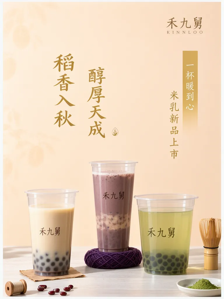
A drinks shop wanted an in-store poster by the entrance to introduce a new rice-milk range. This is a real customer case; the shop’s real name and product names have been replaced with pseudonyms. Any prices or figures shown are placeholders for the example. The brief was to make three drinks feel like one seasonal launch while keeping their colors distinct.
TL;DR
- A pale peach-cream background and muted gold type tie the three drinks together.
- “稻香入秋” and “醇厚天成” lead, while “米乳新品上市” states the launch.
- We made the product photos first, then arranged them within the poster layout.
- Proof the small copy at the distance customers will view the poster.
How do three rice-milk drinks become one launch story?
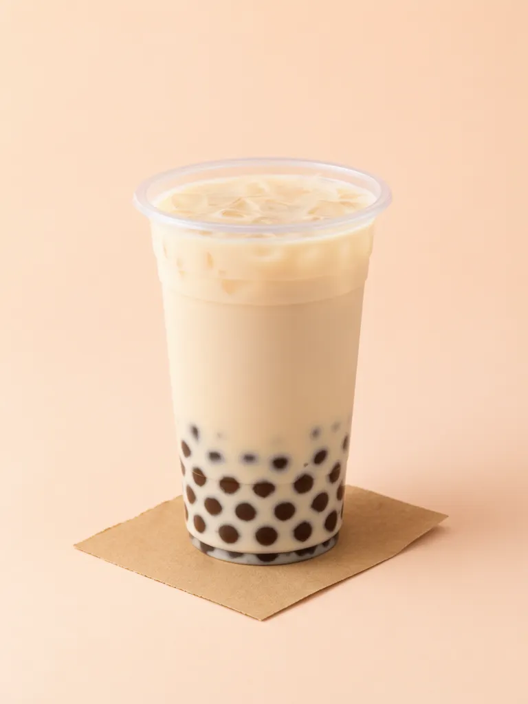
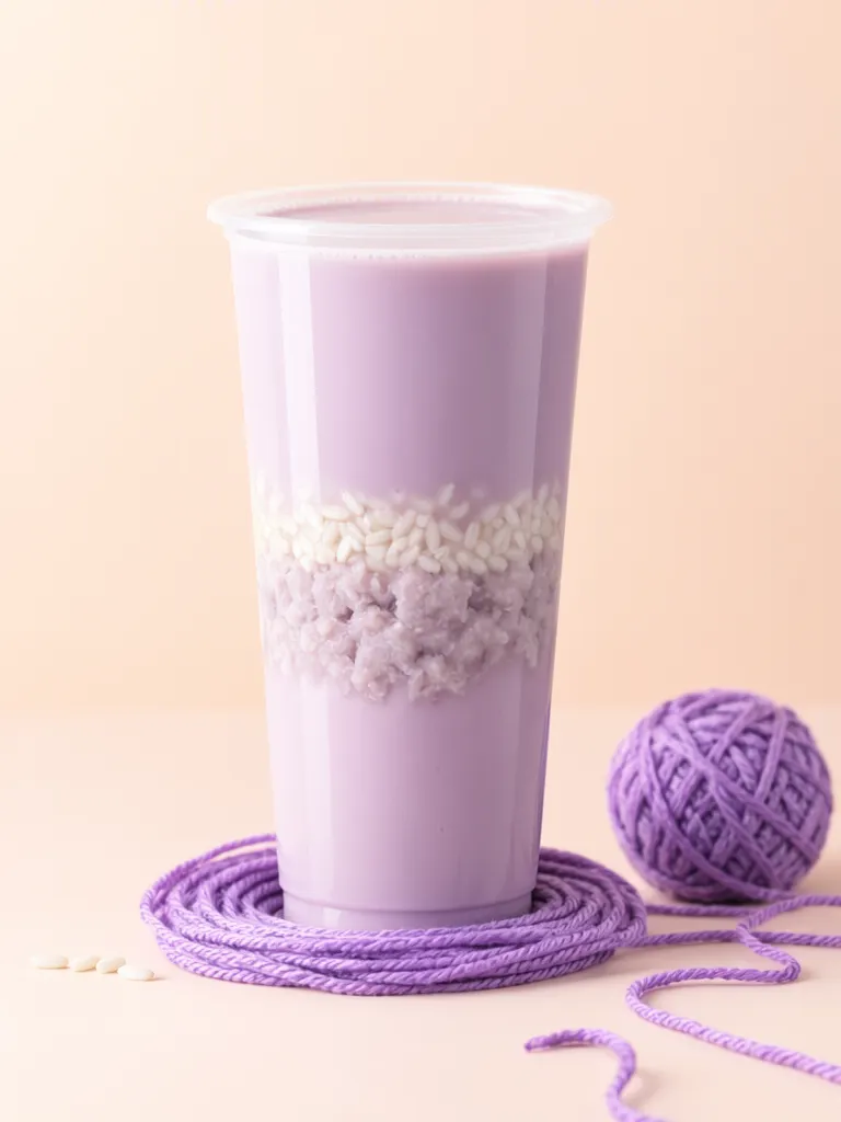
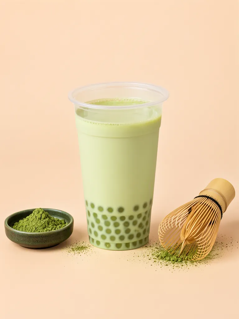
The poster brings together 珍珠米乳奶茶 (rice milk tea with pearls), 紫薯芋泥米乳 (purple taro rice milk), and 抹茶米乳 (matcha rice milk) in a soft autumn palette. The first is creamy with dark pearls gathered at the bottom; the taro drink has a purple-brown layered look; and the matcha version is pale green, paired with a whisk and matcha powder. Clear cups and the shared peach-toned setting make the trio read as a range.
Make one like this Open this image on MOSS Image
Made in prompt mode with this exact prompt:
Product photograph of a clear plastic cup of creamy rice milk tea with dark brown tapioca pearls at the bottom, on a small square of brown kraft paper, pale peach background, soft light. Nothing in the picture carries any writing: no labels, logos, stickers or printed marks.
Make one like this Open this image on MOSS Image
Made in prompt mode with this exact prompt:
Product photograph of a tall clear plastic cup of purple taro rice milk with a layer of mashed taro and rice grains in the middle, on a coil of purple yarn, pale peach background, soft light. Nothing in the picture carries any writing: no labels, logos, stickers or printed marks.
Make one like this Open this image on MOSS Image
Made in prompt mode with this exact prompt:
Product photograph of a clear plastic cup of matcha rice milk, pale green with dark green pearls at the bottom, a bamboo matcha whisk and a small dish of matcha powder beside it, pale peach background. Nothing in the picture carries any writing: no labels, logos, stickers or printed marks.
What gives the poster its hierarchy?
The portrait poster uses a pale peach-cream gradient with muted gold vertical calligraphy. The headline pair, “稻香入秋” and “醇厚天成,” draws the eye first; “米乳新品上市” identifies the occasion, and “一杯暖到心” closes the thought. The three cups occupy the lower area, so product colors and toppings remain visible. A small bilingual mark sits near the top, with simple black marks on the cups.
Make one like this Open this image on MOSS Image
Trademarks and copy in the image have been altered to avoid infringement.
Made in the Layout Builder with these boxes:
| Box text | Appearance |
|---|---|
| 禾九舅 / KINNLOO | Small muted-gold Chinese and Latin mark |
| 稻香入秋 | Large vertical gold calligraphy |
| 醇厚天成 | Large vertical gold calligraphy |
| 米乳新品上市 | Small vertical gold print |
| 一杯暖到心 | Small vertical gold print on an ochre strip |
| 禾九舅 | Black Chinese cup mark |
| 禾九舅 | Black Chinese cup mark |
| 禾九舅 | Black Chinese cup mark |
How do I make a similar launch poster?
- Settle the headline, range name, product names, and closing line first; have the shop proof every character.
- Make product photos in the studio, describing the cup, colors, ingredients, and background for each one.
- Open the AI poster generator and use Layout Builder boxes for the mark, headline, and product areas.
- Check the headline, product names, and cup marks, then inspect the poster at its intended entrance viewing size.
What still needs checking after generation?
The boxes decide where each line sits; they do not proof it. The shop mark appears four times on this sheet — once near the top and once on each cup — so one slipped stroke repeats across the whole picture and is easy to miss on a phone. Print the file at the size it will hang, stand where a customer will stand, and read the headline, the range name, and every mark out loud before it goes up.
MOSS Image Studio is an independent hosted studio for the open MOSS-Image model. Not affiliated with OpenMOSS.
FAQ
Do all three drinks need the same background?
No. A related background can make the range feel cohesive while each drink keeps its own color and ingredients.
Can I reuse the wording in the poster?
The copy in this case image has been altered. Use names and wording the shop has confirmed it can publish.
Why make the product photos first?
It helps establish each cup’s shape, color, and toppings before you decide how much space each product needs in the layout.
Do the Layout Builder boxes guarantee the copy is right?
No. The boxes place each line; the characters inside it are still drawn by the model and need the same character-by-character proofreading as any other step.
Try it with your own words
Open the Studio, write a brief or lay out boxes on the canvas, and generate with MOSS-Image.