Three Poetry Book Cover AI Prompts with Space to Breathe
Compare poetry book cover AI prompts for an original title and pen name, then check lettering, negative space, illustration style and production specs.
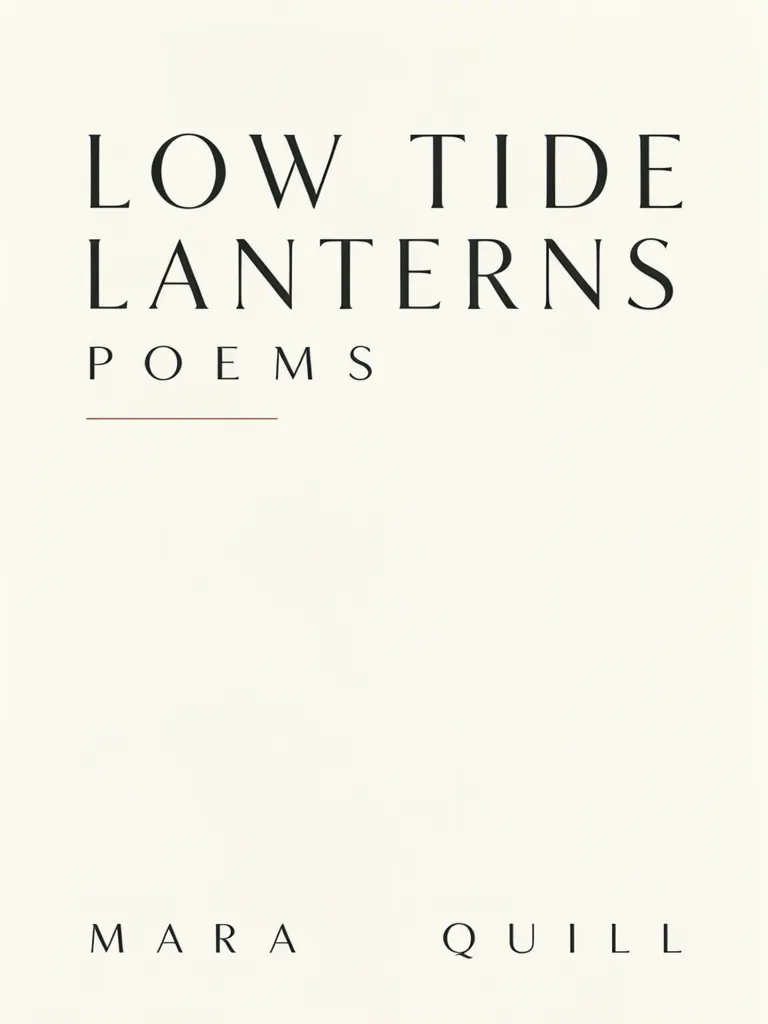
Three poetry cover prompts can test an original title and pen name in different treatments: a mostly empty typographic cover, overlapping abstract shapes, and an illustrated scene. We generated all three for the fictional collection LOW TIDE LANTERNS by MARA QUILL. The words came out correctly each time, but the ink drawing prompt produced a photographic-looking beach scene. These are concept images, so check the title at the size readers will see it and do not treat a generated cover as a finished publishing file.
TL;DR
- Test the title and pen name in separate, clearly described positions.
- Compare a typographic cover with abstract and illustrated directions before settling on a mood.
- Keep negative space intentional, especially around a short title.
- Inspect the result for extra marks and verify any real production requirements separately.
What do three poetry cover prompts show?
They show how the same title and author line can sit in three visual approaches. The examples use a made-up title and pen name, and none contains a publisher logo, barcode or blurb. That makes it easier to judge the hierarchy without mistaking the mock book for a published title.
Make one like this Open this image on MOSS Image
Made in the Layout Builder with these boxes:
| Box text / object | Job | Approximate position |
|---|---|---|
| LOW TIDE LANTERNS | Book title | Upper left |
| POEMS | Small label | Upper-left area, below title |
| Thin horizontal line | Divider | Near the middle |
| MARA QUILL | Pen name | Bottom |
The lower half stays largely open. The pen name sits wide across the bottom, with a large gap between its two words. This is a useful reminder that a box can establish where text belongs while still leaving the model room to interpret spacing. If the gap looks too broad for your real name, revise the position or describe a more compact treatment.
Make one like this Open this image on MOSS Image
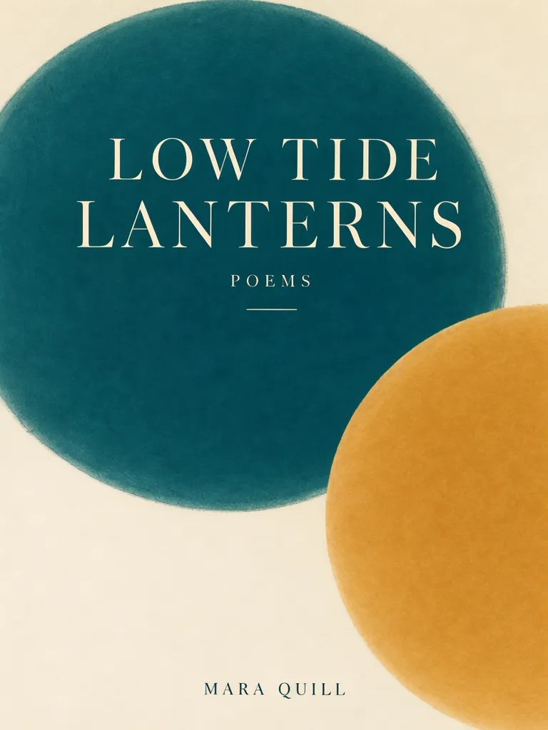
Poetry book cover, front view, flat print. Two large overlapping soft circles in deep teal and ochre on a warm off-white background, the lower half left empty. Title in an elegant cream-on-teal serif across the teal circle, pen name small at the bottom. No publisher logo, barcode, price, blurb or series name. Text, render exactly and add nothing else: title 'LOW TIDE LANTERNS'; label 'POEMS'; author 'MARA QUILL'.
The cream title sits on the teal circle and the ochre circle overlaps at lower right. All three requested lines are present, without extra text. A written prompt can describe a visual relationship such as one circle overlapping another, while the Layout Builder gives the text regions distinct boxes. Neither approach turns the image into an editable typesetting document.
Make one like this Open this image on MOSS Image
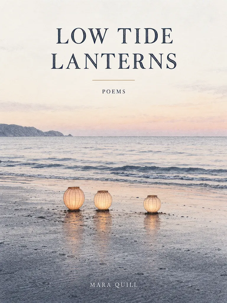
Poetry book cover, front view, flat print. A fine ink drawing of three small paper lanterns resting on wet sand at low tide, a pale dusk sky taking up the upper half. Title in an elegant dark ink serif in the empty sky, pen name small at the bottom. No publisher logo, barcode, price, blurb or series name. Text, render exactly and add nothing else: title 'LOW TIDE LANTERNS'; label 'POEMS'; author 'MARA QUILL'.
This result contains the requested words but looks photographic: glowing lanterns sit on a realistic beach rather than in a fine ink drawing. That difference matters when the illustration style is part of the cover concept. A prompt can name a medium, yet the output still needs a visual check against the intended direction.
| Direction | What the example emphasizes | What to inspect |
|---|---|---|
| Typographic | Empty space and title placement | Whether title and author spacing feels deliberate |
| Abstract | Colour fields behind the title | Contrast and whether shapes crowd the type |
| Illustrated | A scene that supports the title | Whether the chosen medium actually appears |
How should title and pen name share the cover?
Give them separate roles. A poetry collection often has a short title that can carry the main visual weight, while the pen name can sit lower and quieter. In these examples, the title is LOW TIDE LANTERNS, the genre label is POEMS, and the pen name is MARA QUILL. Those are fictional strings; substitute the real title and author name before generating.
For a cover with generous negative space, state what should remain empty and where. The typographic version uses an otherwise spare page; the abstract prompt says the lower half stays empty; the illustrated prompt puts the title in the open sky. These descriptions make the empty area part of the composition rather than an accidental blank patch. If the title becomes difficult to read, reduce visual detail behind it or move the lettering into a calmer region.
If your title is longer, test its line break as part of the composition. Write the exact title with the intended capitalization, then review whether it breaks at a sensible phrase boundary. A cover that reads at full size may become a dark block when reduced, so make a small preview and check whether the title remains distinct from the artwork.
When does a written prompt help more than boxes?
A written prompt is convenient for exploring an overall visual direction, such as soft circles or lanterns at dusk. The AI poster generator accepts a scene description and quoted text. The Layout Builder is useful when you want to give the title, label and pen name their own regions. In our typographic version, the title and author are separate boxes; the prompt versions describe their relationship in prose.
For books, think of either result as a concept to evaluate. Generated lettering is part of the image. If the final cover needs precise typesetting, use the image as a visual reference and set the final text in a publishing workflow that gives you direct control over type. The JSON Layout guide explains the box-based approach, and the exact text guide discusses text rendering in generated images.
What should you check before using a poetry cover?
Check the spelling and line breaks of the title, the author name, contrast, and the amount of empty space at a reduced size. Also compare the illustration with the medium you asked for: the ink prompt in this set came out photographic. None of the three examples added a publisher logo, barcode or blurb, but that does not establish any publisher or retailer requirements.
These images are visual concepts, not confirmed print-ready files. We did not test them against any publisher's cover template, trim size, bleed, spine width, barcode placement or ebook storefront rules. Confirm those specifications with the relevant publisher or service, then prepare the production file to match them. Do not add a real imprint's mark unless you have the right to use it.
How do you make your own poetry cover prompt?
- Write the exact title, genre label if needed, and pen name. Keep example text out of the final copy.
- Choose a direction: typographic, abstract or illustrated. Name the medium and the area where the title should sit.
- Use the Layout Builder for separate title and author boxes, or the AI poster generator to explore a scene prompt.
- Generate a few concept directions, then inspect the title, author spacing, contrast and negative space at thumbnail size. Read the poster prompt guide for ways to describe a scene.
- Confirm the final dimensions and production requirements with the publisher or storefront before preparing a final file.
MOSS Image Studio is an independent hosted studio for the open MOSS-Image model. Not affiliated with OpenMOSS.
FAQ
What should a poetry book cover prompt include?
Include the exact title and pen name, the visual direction, where the title should sit, and what space should stay clear. Separate the title and author roles so the hierarchy is easy to assess.
Can AI make a minimalist poetry cover?
It can generate a sparse concept, as the mostly empty typographic example shows. Check whether the open space and text placement match your intended design.
Is a generated poetry cover ready to publish?
Do not assume so. Check the text and artwork, then confirm the required dimensions and production rules with the publisher or storefront.
How can I keep a long poetry title readable?
Try the intended line break, use a quiet area behind the words, and review a thumbnail. Change the composition if the title blends into the illustration.
Try it with your own words
Open the Studio, write a brief or lay out boxes on the canvas, and generate with MOSS-Image.