AI Poster Failures: Three Real Studio Attempts and Fixes
See three real MOSS Image Studio poster failures, the visible text or hierarchy issue in each, and the specific change shown in the corrected examples.

AI poster failures are useful when they show a specific decision a reader can make differently. We collected three real earlier attempts from MOSS Image Studio: one added unrequested copy, one merged a space in a product condition, and one gave a coupon code too little visual weight. Each example is paired with the change that produced the version shown in the linked article. They are three examples, not a failure rate.
TL;DR
- Check for extra lettering on objects as well as on the main poster.
- Read spaces and punctuation inside short product phrases closely.
- Verify hierarchy separately from spelling: the right code can still be hard to find.
- Separate what you can see by eye from text claims that would need OCR or a closer check.
The tea shop, tins, offers, stationery shop, coupon code and dates shown in these examples are fictional.
What happens when a poster invents extra text?
It can add words to both the headline area and illustrated objects. This tea bundle prompt asked for a Black Friday offer with plain text on the poster. The first attempt included a garbled tagline below the offer and invented labels on the tea tins. Both additions are visible in the image itself; no OCR is needed to notice them.
Make one like this Open this image on MOSS Image
Asked with this exact prompt:
Black Friday bundle offer poster for a small tea shop, flat illustration on deep red, three tins of loose-leaf tea in a row, cream and gold type, strong hierarchy. The offer and its conditions sit in separate boxes. Text, render exactly and add nothing else: headline 'BLACK FRIDAY'; offer 'BUY 2 TEAS, GET 1 FREE'; box 'ANY 100 G TIN'; small line 'FREE TIN IS THE LOWEST PRICE'; footer 'NOV 27 – NOV 30'.
For the next attempt we asked for plain, unlabelled tins and no tagline. That removed both extras, and a different error took their place, shown in the next section. Describe objects as unlabelled when you want no lettering, then inspect around the main copy.
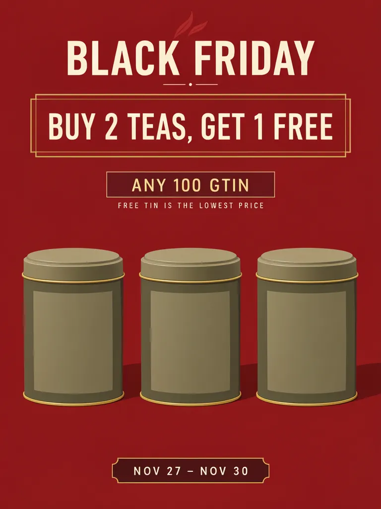
How can a space disappear inside a correct-looking line?
A short condition can read as a different unit when a space is lost. The second tea attempt removed the invented extras, but “ANY 100 G TIN” appeared as “ANY 100 GTIN.” The merge is visible in the lettering: the lone unit letter ran into the next word.
Make one like this Open this image on MOSS Image
Asked with this exact prompt:
Black Friday bundle offer poster for a small tea shop, flat illustration on deep red, three plain unlabelled tea tins in a row with no writing or labels on them, cream and gold type, strong hierarchy, no tagline under the offer. The offer and its conditions sit in separate boxes. Text, render exactly and add nothing else: headline 'BLACK FRIDAY'; offer 'BUY 2 TEAS, GET 1 FREE'; box 'ANY 100 G TIN'; small line 'FREE TIN IS THE LOWEST PRICE'; footer 'NOV 27 – NOV 30'.
The third attempt rewrote the line as “ANY 100-GRAM TIN”, which leaves no lone letter to merge, and all five lines came out right. The Black Friday discount terms article shows that result. On your own poster, compare the whole line with your source, especially around units, hyphens and spaces.
Can every line be right while the poster still fails its purpose?
Yes. The coupon attempt spelled the code correctly, but the code was no larger than the headline, so it was not the first thing a shopper would see, which was the point of the graphic. This is a hierarchy problem visible by eye, not a text-recognition ambiguity. The Cyber Monday coupon article shows the layout-built version where the code does lead the reading order, and its plain prompt-mode retry is the weaker one below.

Make one like this Open this image on MOSS Image
Asked with this exact prompt:
Square social media graphic for an online stationery shop's Cyber Monday sale, flat illustration, soft lilac background, a large paper coupon ticket with a perforated edge in the centre, a few pencils and notebooks around it. The code is printed in big bold monospaced capitals on the ticket. Text, render exactly and add nothing else: headline 'CYBER MONDAY'; line '25% OFF SITEWIDE'; small label 'USE CODE'; code 'CYBER25'; footer 'ONLINE ONLY · ENDS NOV 30'.
Proofread in two passes: compare the copy, then check prominence. At normal size, the key code, date or price should be easy to find while supporting conditions stay readable. Weak reading order is also one of the complaints designers raise about AI flyers in a graphic design discussion, along with crowded, over-decorated layouts.
What should a failure log record?
Keep the original prompt, the image, the visible issue and the adjustment that followed. If you can point to the unwanted label or merged letters in the pixels, describe that visual evidence directly. If an OCR tool flags a character that is difficult to distinguish, call it an OCR flag that needs human inspection rather than a confirmed error. Text recognition can help locate a line, but it does not judge whether a code is prominent or a composition feels crowded.
A fourth example is the first photo-poster try in our background blur test: the requested greenhouse background was blurred and the poster text stayed sharp, while the time line lost spaces and the cutting line lost its comma. A complaint about blur can turn out to be a punctuation error.
Visual inspection and OCR answer different questions. The image shows extra labels and weak code emphasis; OCR can flag a possible character difference, but stylized lettering may make that result uncertain. For a real offer, compare with approved copy and ask another person to read the final version.
What are the limits of these examples?
| Attempt | What went wrong | The change that fixed it |
|---|---|---|
| Tea bundle, first try | A garbled tagline under the offer, plus invented labels on the tins | Asked for plain, unlabelled tins and no tagline |
| Tea bundle, second try | “ANY 100 G TIN” came out as “ANY 100 GTIN” | Rewrote the line as “ANY 100-GRAM TIN”, so no lone letter could merge |
| Coupon code | Every line spelled right, but the code was no larger than the headline | Built it in the Layout Builder, with the code leading the reading order |
These are three specific failures and their recorded fixes, not a guarantee that a prompt change will always work. The tea attempts added extra text and merged a space; the coupon attempt had weak code hierarchy. The separate photo-poster try lost spaces and a comma. Check every line and the overall reading order on each result you plan to use.
For contractual wording, prices, dates and discount terms, proofread against the approved source before sharing or printing.
How do you make and check your own poster?
- Pick the mode for the information: use prompt mode for a short scene and quoted copy, or the Layout Builder when each line needs its own box.
- Keep required wording in short, separate lines. For a product unit, write the full phrase rather than relying on a cramped abbreviation; for an illustration, say whether it should have labels.
- Generate at the aspect ratio you need, then read every character and inspect the objects for invented markings.
- Check hierarchy at the expected display size: locate the code, offer or date without zooming in, then verify supporting conditions remain readable. See the exact-text guide for a practical line-by-line check.
MOSS Image Studio is an independent hosted studio for the open MOSS-Image model. Not affiliated with OpenMOSS.
FAQ
Why does an AI poster add words I did not ask for?
An image can contain lettering beyond the requested copy, including marks on illustrated objects. Inspect both the main text and the surrounding scene, and describe objects as unlabelled when that is what you want.
How do I catch a missing space in poster text?
Compare the result with the source wording one character at a time. Pay close attention to measurement units, hyphens and spaces between a number and a noun.
How do I check whether a poster has clear visual hierarchy?
View it at normal size and identify the first line you notice. If the key code, price or date is not easy to find, revise its box or simplify nearby decoration.
Can OCR confirm that poster text is correct?
OCR can help identify text to inspect, but stylized characters can be ambiguous. Compare important wording with the approved source and verify the pixels yourself.
Sources
- Reddit discussion: “How do you recognize AI graphic design?” — designers describe crowded, over-decorated AI flyers with weak reading order. Checked on 2026-11-03.
Try it with your own words
Open the Studio, write a brief or lay out boxes on the canvas, and generate with MOSS-Image.